Scalable creative systems, paid social frameworks, campaign creative, and product development for a design-driven e-commerce platform serving 2M+ customers.


First creative hire in Brand Creative department, aimed at elevating brand's visual language across marketing, social, print, event, and retail touchpoints. Alongside department director, redefined design infrastructure, campaign frameworks, and production workflows for iconic luxury home décor brand.


Full identity system and brand guidelines for an AI-native communications agency, built to scale from launch.
Illustration system, product UI, and brand identity for a platform integrating handcrafted design with AI-driven storytelling.
Product photography, web design, and animation from a formal client brief at Wix Playground Academy.
Site architecture and web design for a digital-first career coaching platform.
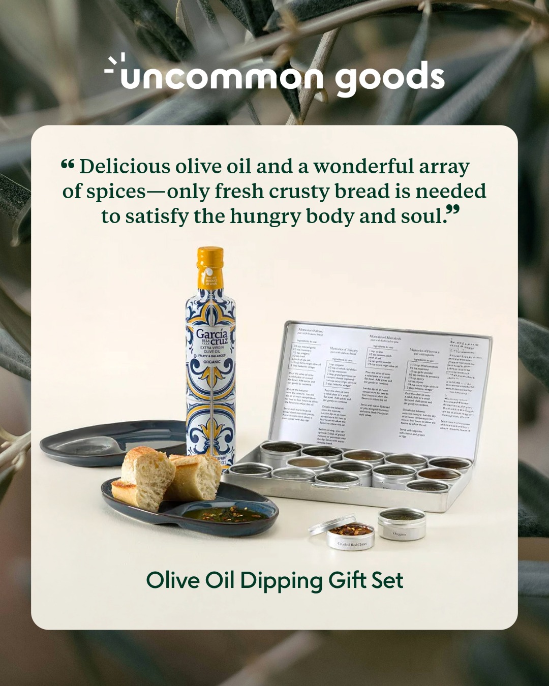
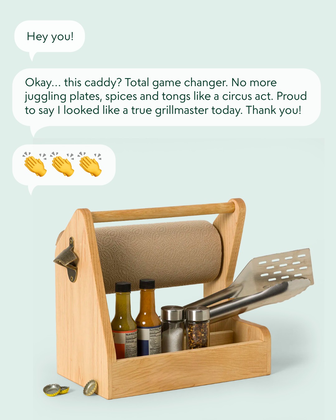
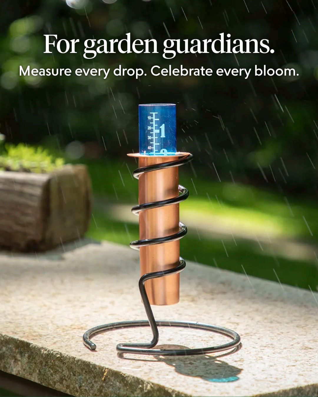
Scalable creative systems and multi-channel campaign execution for a design-driven e-commerce platform serving 2M+ customers.


As Senior Graphic Designer, I operate across a cross-functional team of art directors, merchandisers, photographers, copywriters, and product managers—translating brand strategy into repeatable creative systems that scale across every customer touchpoint.
Uncommon Goods is a Brooklyn-based e-commerce company serving over 2 million customers through a curated selection of unique, sustainable products. The brand's commitment to independent makers and design-forward marketing creates a high volume of creative needs across seasonal and evergreen campaigns.
My role spans strategic direction and hands-on production—from defining campaign concepts and pitch frameworks to delivering final assets across email, social, web, and packaging. The volume and cadence of output requires systematized workflows rather than bespoke solutions.
Within the creative department, I serve as one of the senior designers responsible for translating brand strategy into scalable visual execution. I work across the full spectrum of marketing and product development needs while contributing to longer-term brand evolution initiatives—balancing weekly production cadence with system-level thinking.
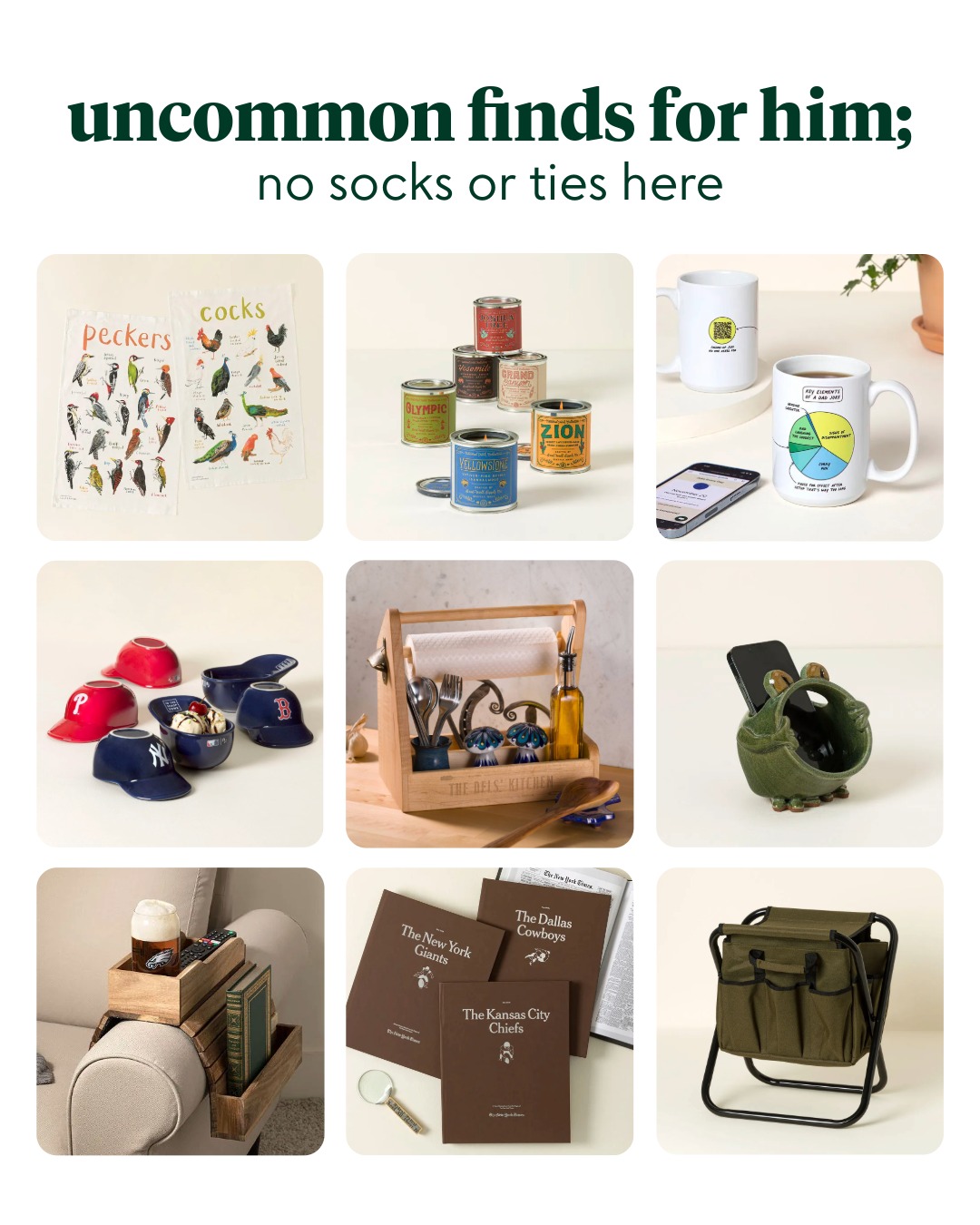
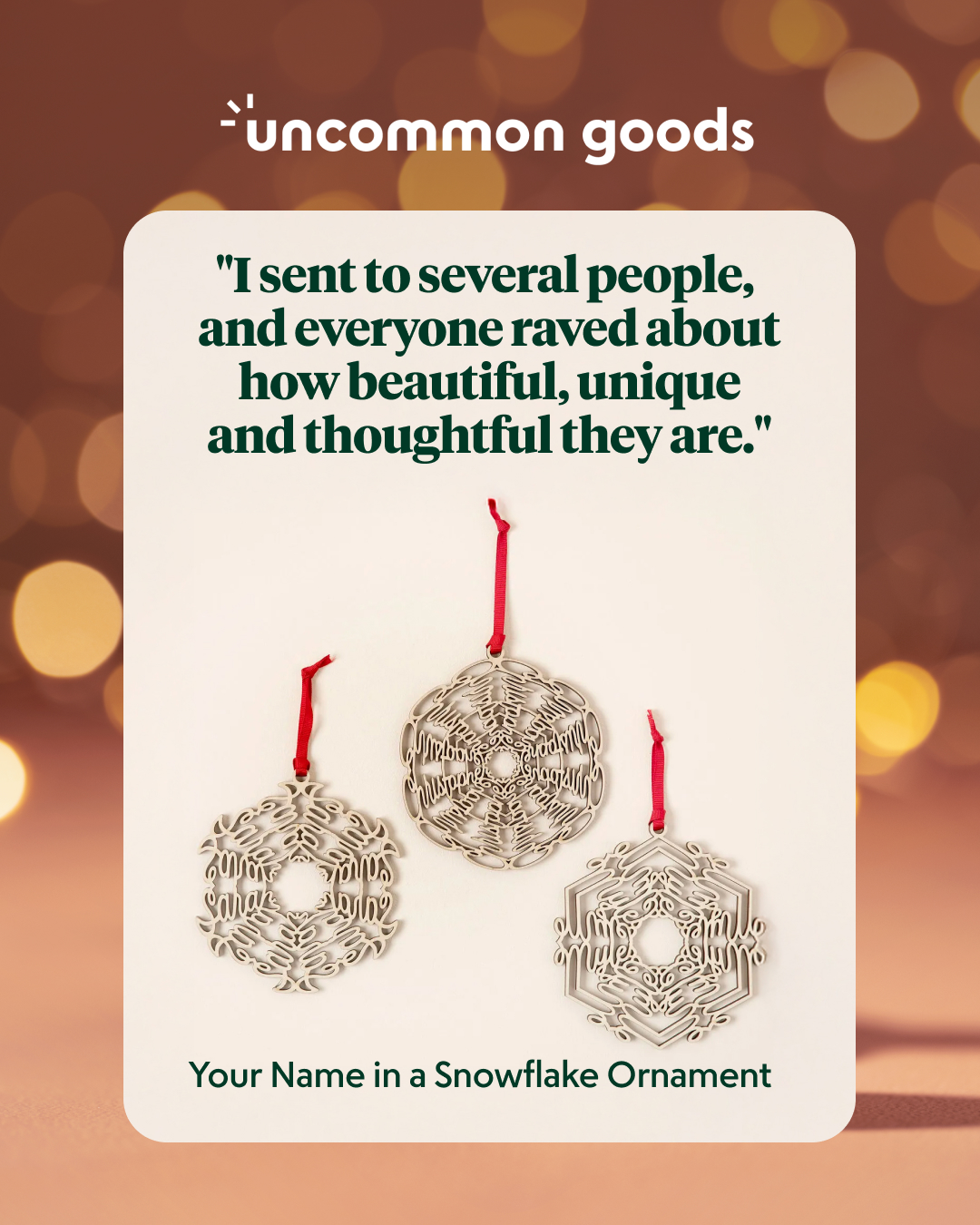
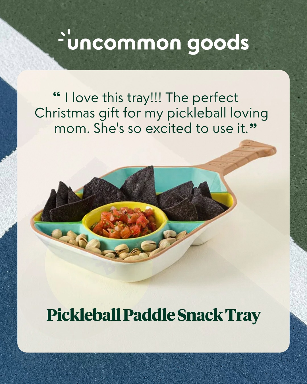
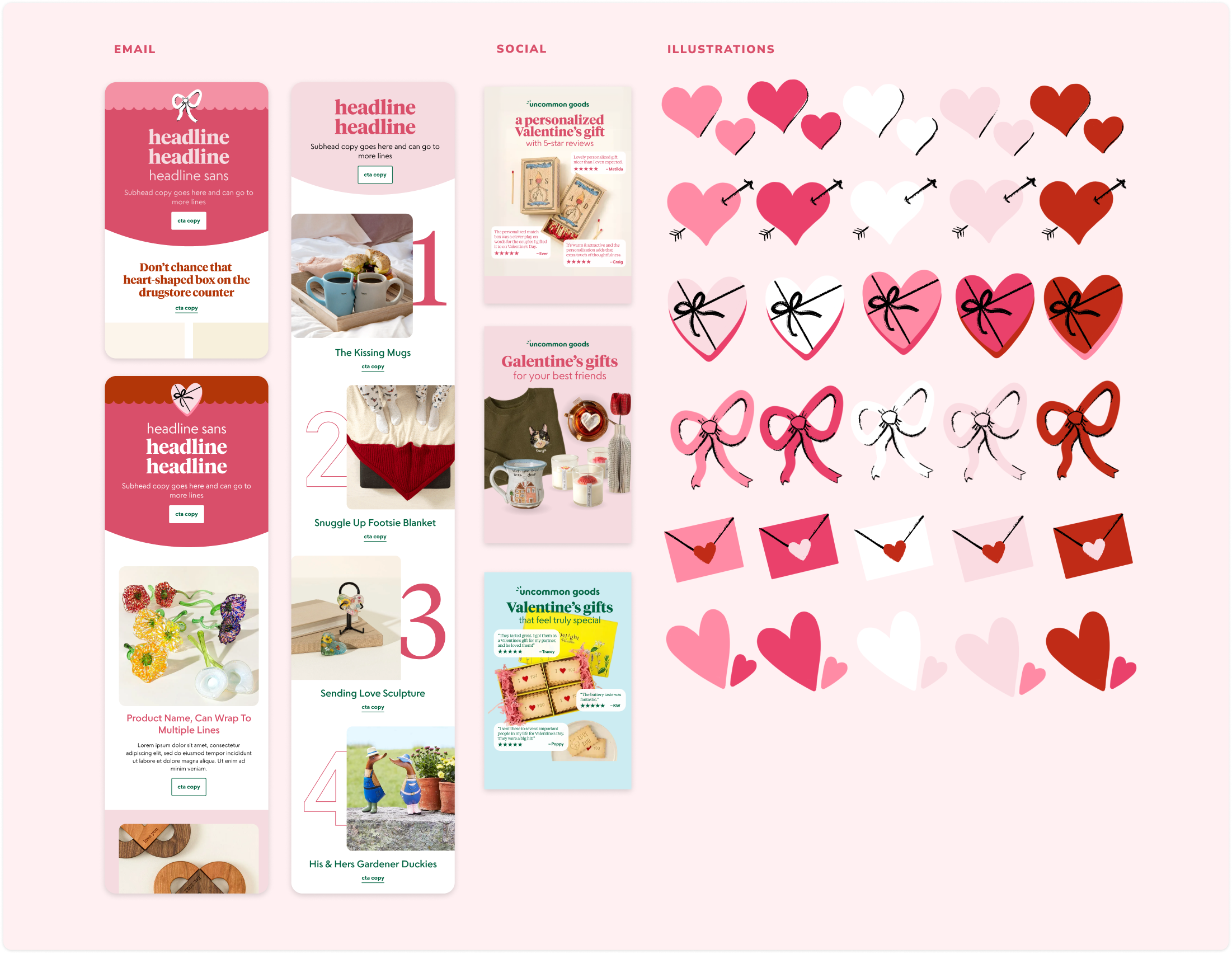
In collaboration with design and creative directors, I structure and produce marketing campaigns that balance performance goals against the playful, thoughtful voice that defines Uncommon Goods. Here's a recent Valentine's day campaign, which is also the first to debut our new illustration style.
My approach establishes a typography-first visual hierarchy optimized for product benefits, personalization, and gifting sentiment. Each campaign cycle informs the next—we test and refine creative iteratively with marketing, using performance data to sharpen decisions while preserving creative intuition.

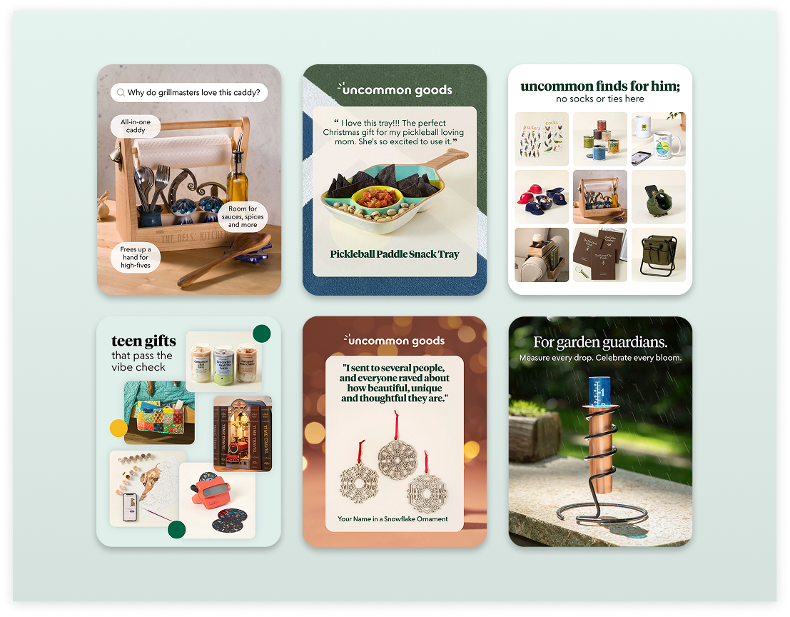
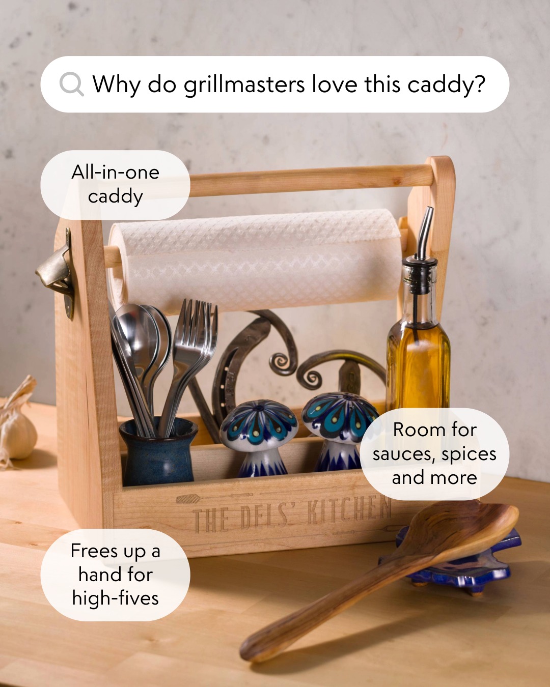
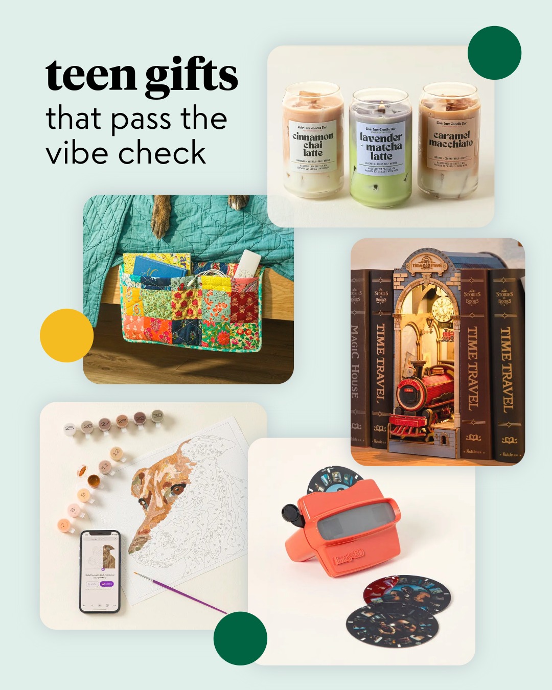
Paid social became one of our highest-ROI channels in 2025, and I operated as the sole designer responsible for all creative across Meta, Pinterest, and Instagram. Working within tight production cycles alongside marketing and analytics, I developed a modular template system for static ads, animated videos, and dynamic product showcases—driving over $1MM in incremental revenue in 2025, with 65% of conversions from new customers.


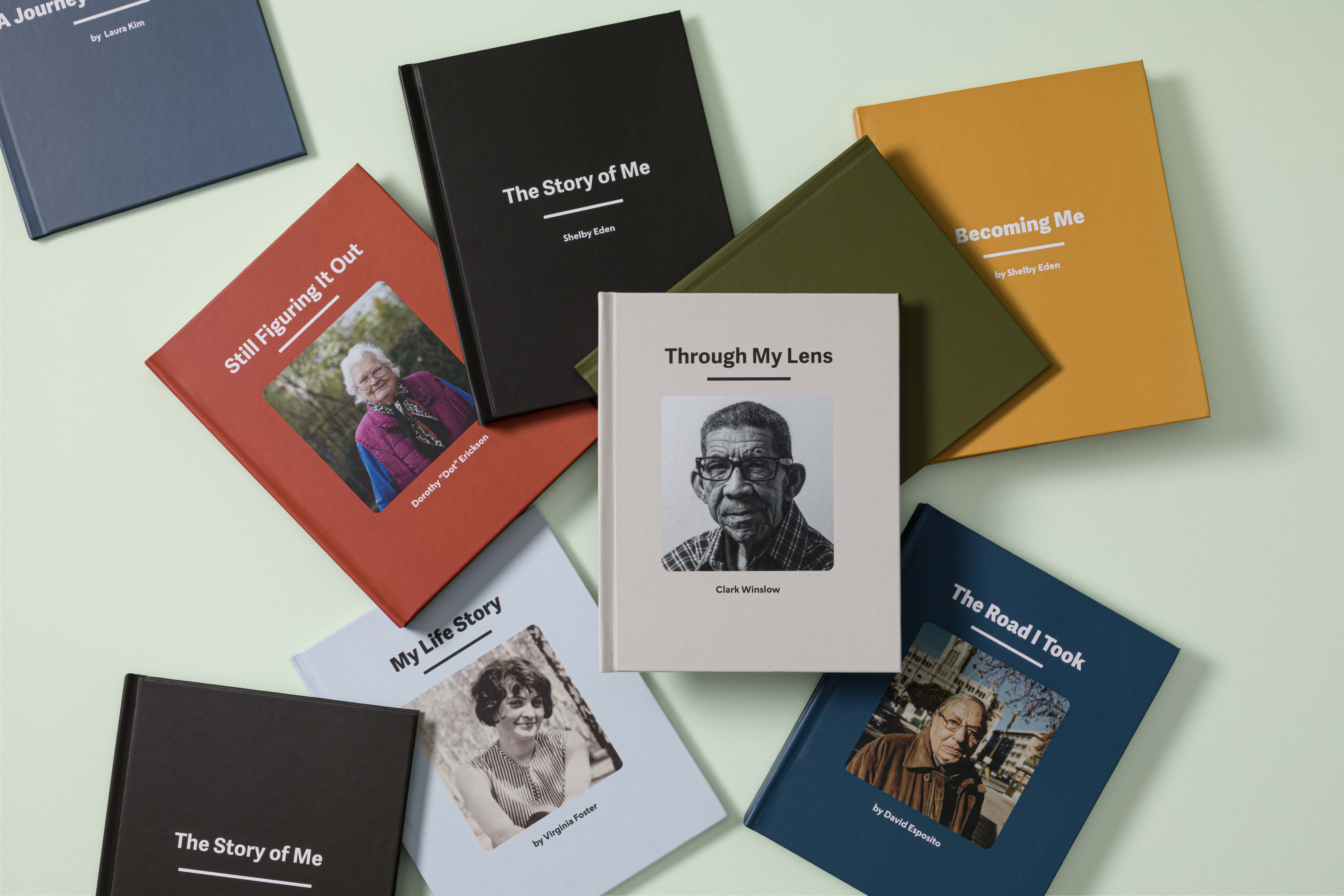
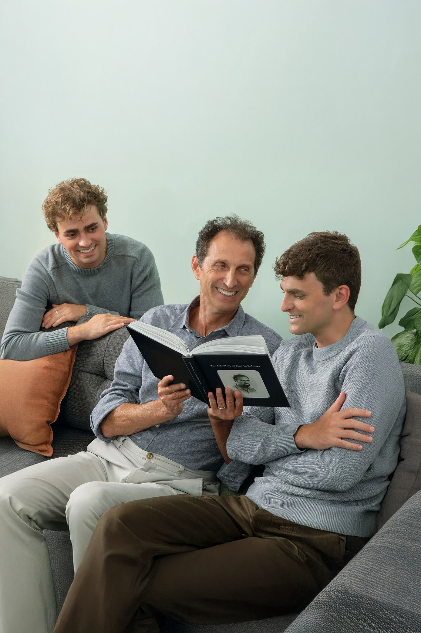
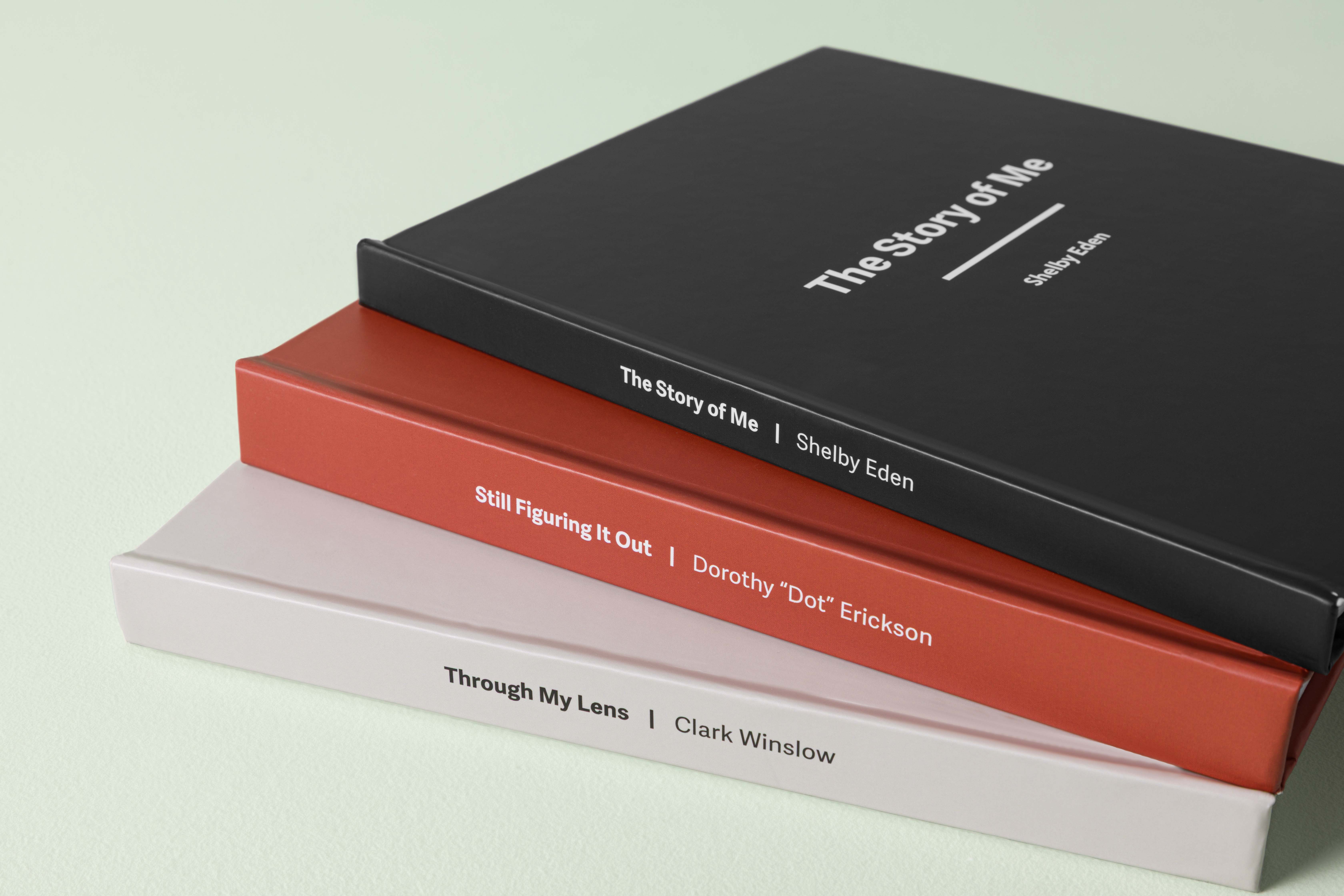
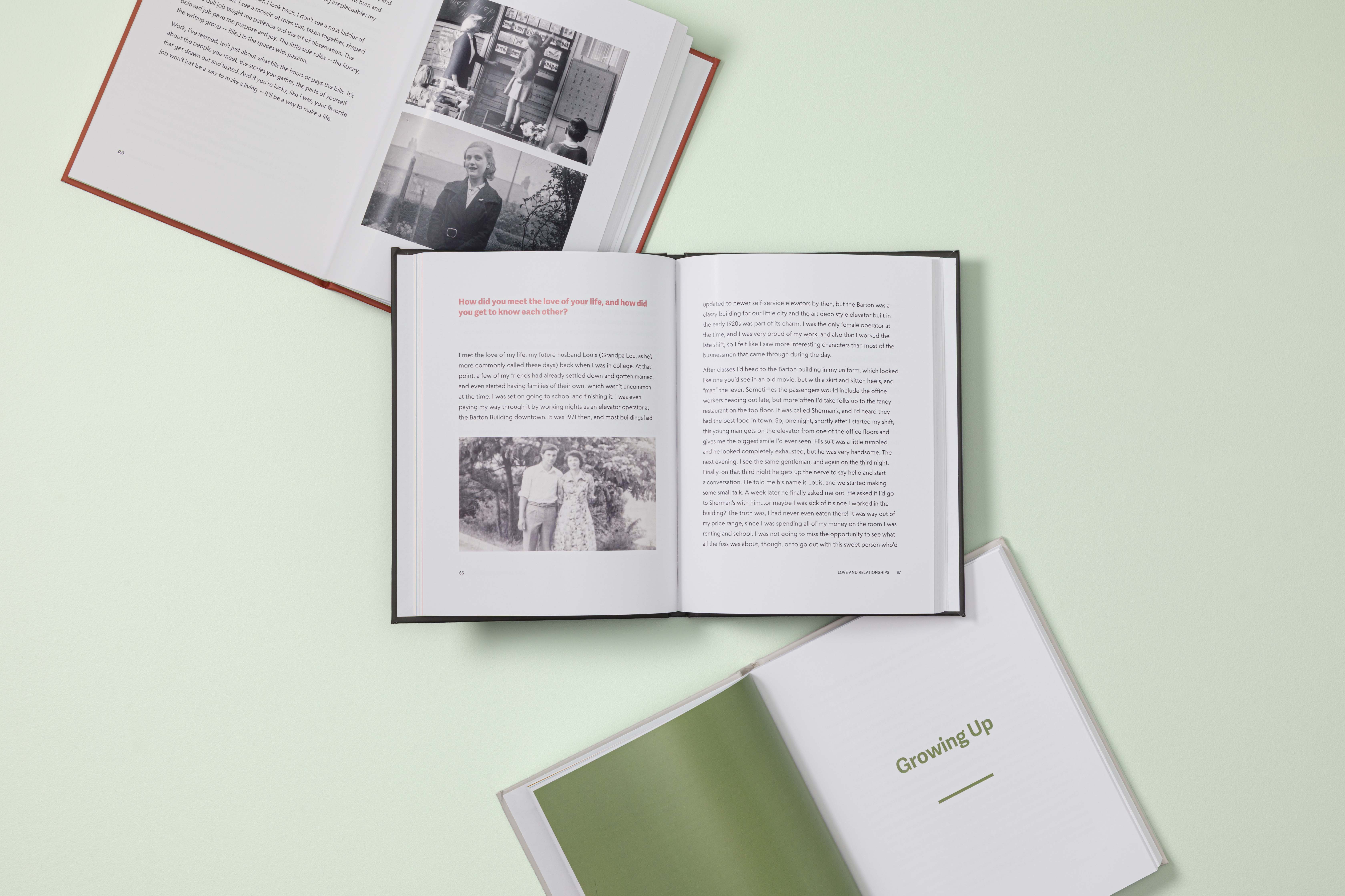
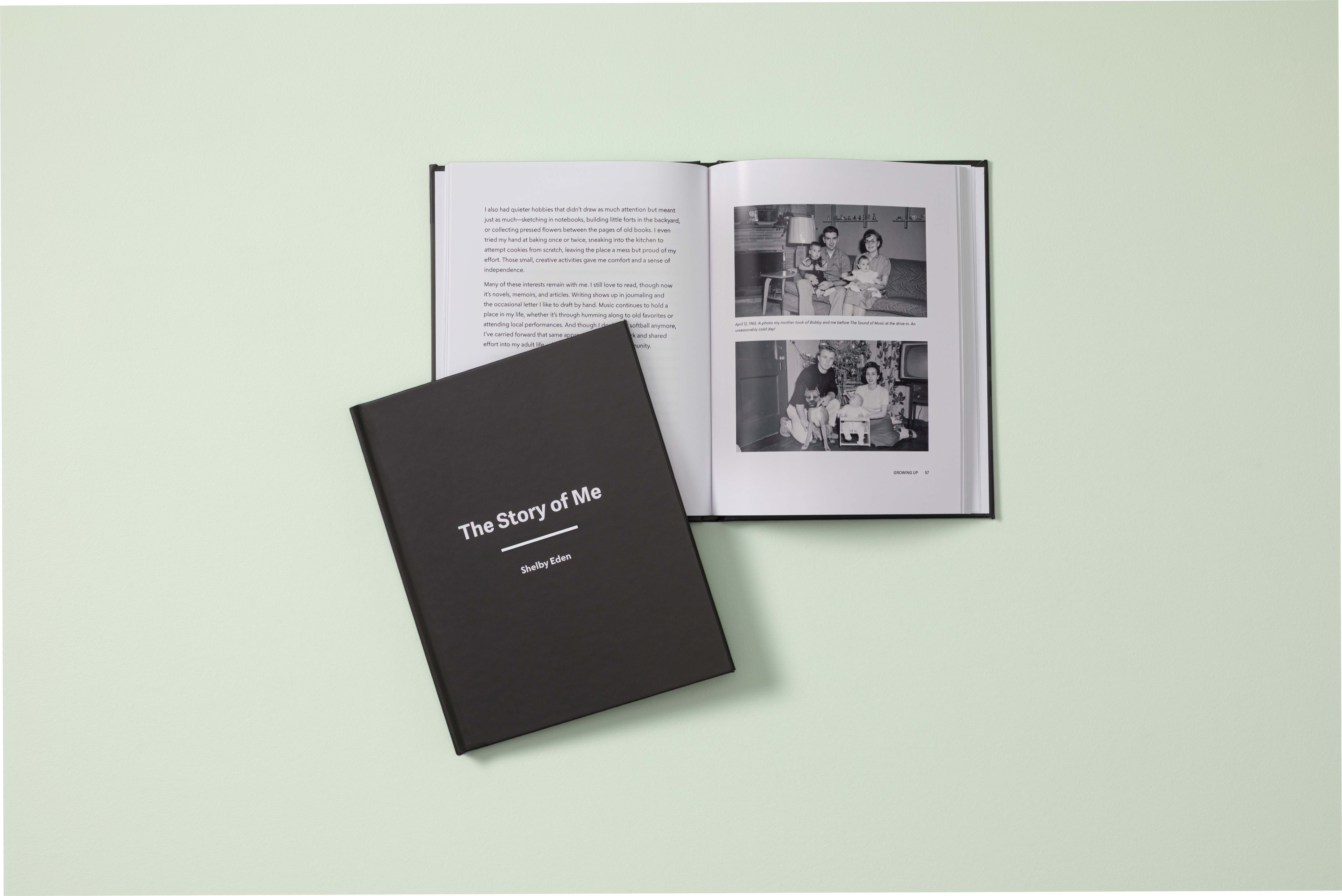
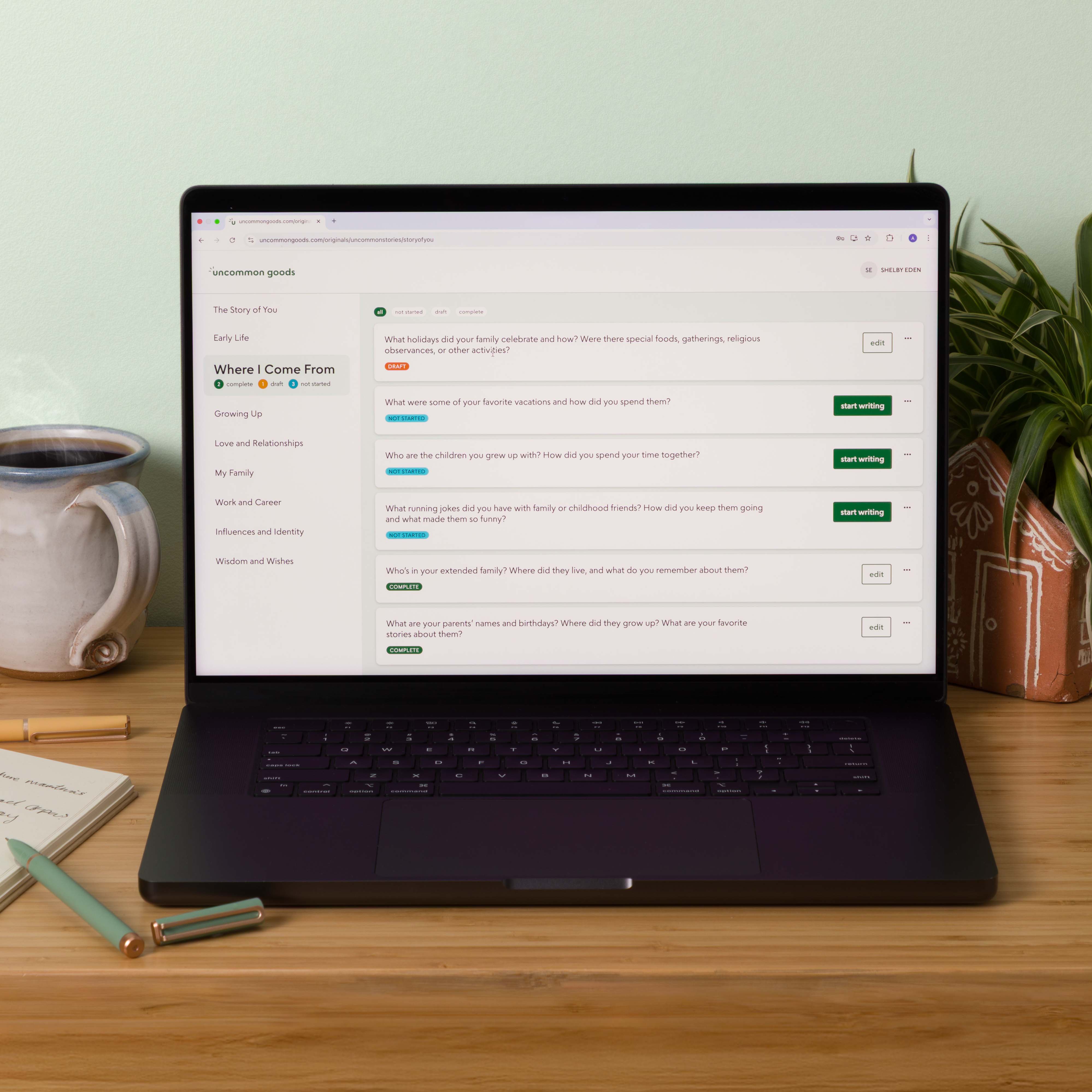
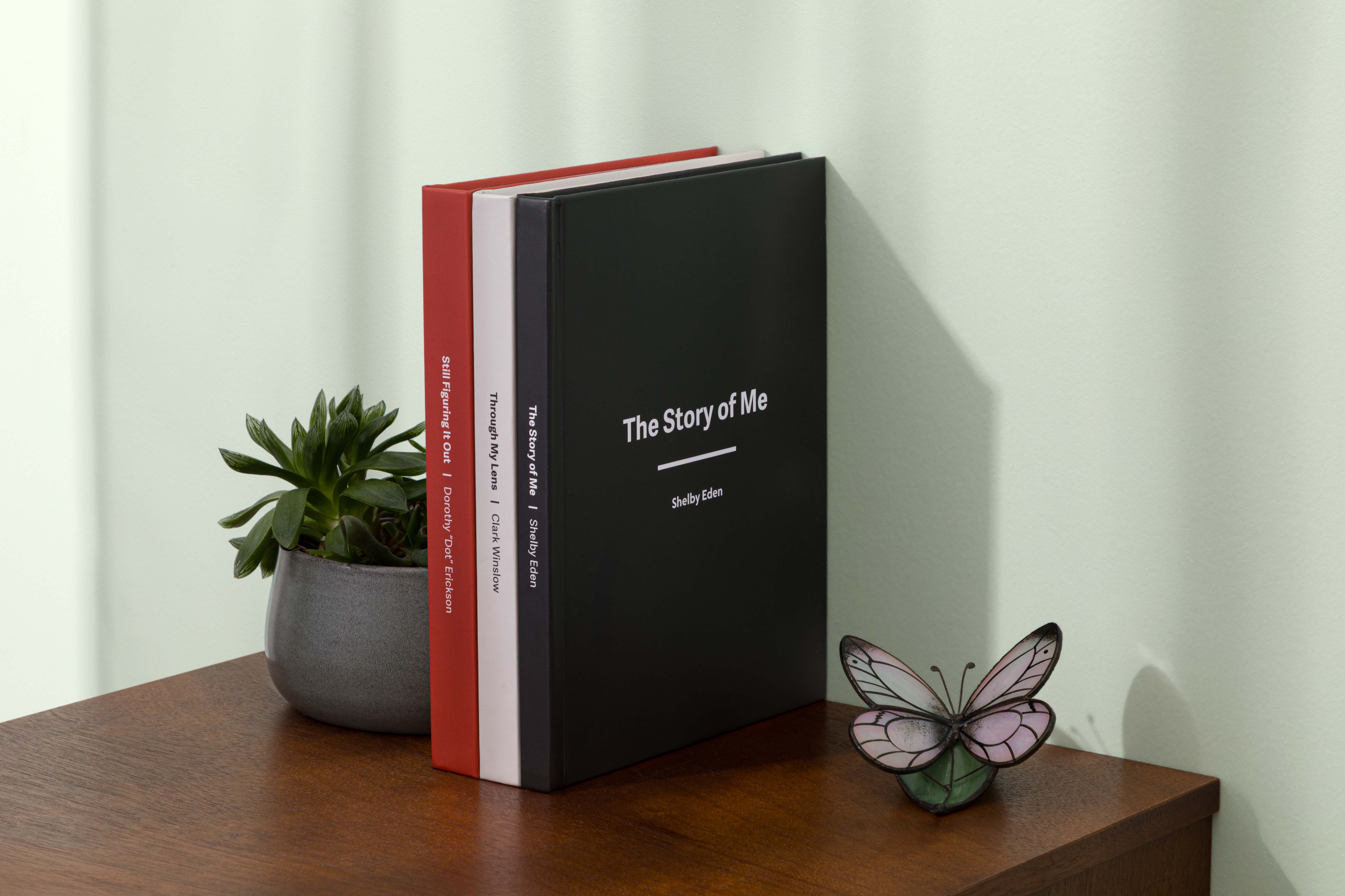
"The Story of You" is a customizable keepsake book that guides customers through creating a personal memoir. As primary designer, I partnered with merchandising, engineering, and product management to define the visual and editorial framework for a 100+ page book—navigating print production constraints, cross-team dependencies, and multiple proofing cycles. The product generated $117k in its first months post-launch, with a follow-up already in development.


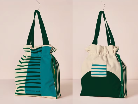
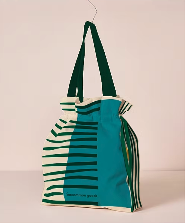
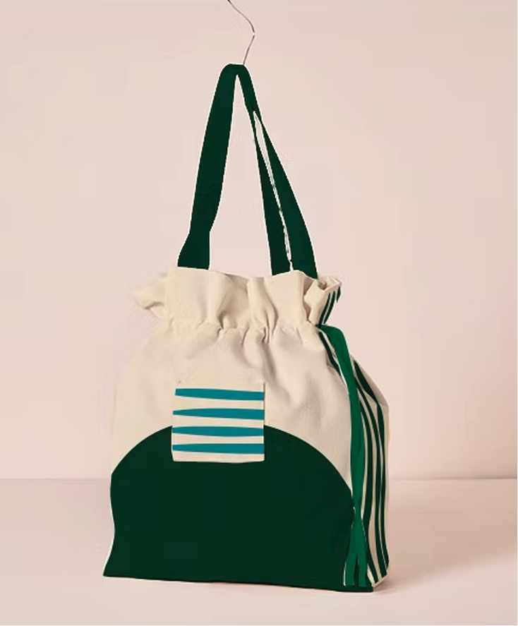
I collaborated with senior leadership to concept, pitch, and design a modular gift packaging system for add-on purchases. The structure offers three sizes with a custom pocket for gift certificates, using sustainable materials aligned with brand commitments. This prioritized scalability and material efficiency over bespoke packaging.


First creative hire for a new in-house department — built design infrastructure, campaign systems, and brand standards from scratch for a luxury home décor brand.


I was the first hire for the in-house Brand Creative team at Jonathan Adler—a new department charged with unifying and elevating brand visuals and voice across all customer touchpoints.
Jonathan Adler is a luxury home décor brand built on maximalist design, bold patterns, and irreverent humor. The brand operates across e-commerce, retail, wholesale, and editorial channels, each with distinct production requirements.
Joining as the senior designer of a department that didn't yet exist gave me the rare opportunity to define systems and processes from the ground up—while maintaining the high bar of craft the brand is known for.
Alongside a weekly marketing production schedule, I worked with the department director to establish repeatable design workflows, documentation, and quality standards. Over three years, each seasonal cycle refined the system: what started as ad-hoc production evolved into a scalable framework that supported the team's growth from one designer to several.
As the team grew, I transitioned from individual contributor to design lead—mentoring junior designers while continuing to own high-visibility projects and the underlying systems they worked within.
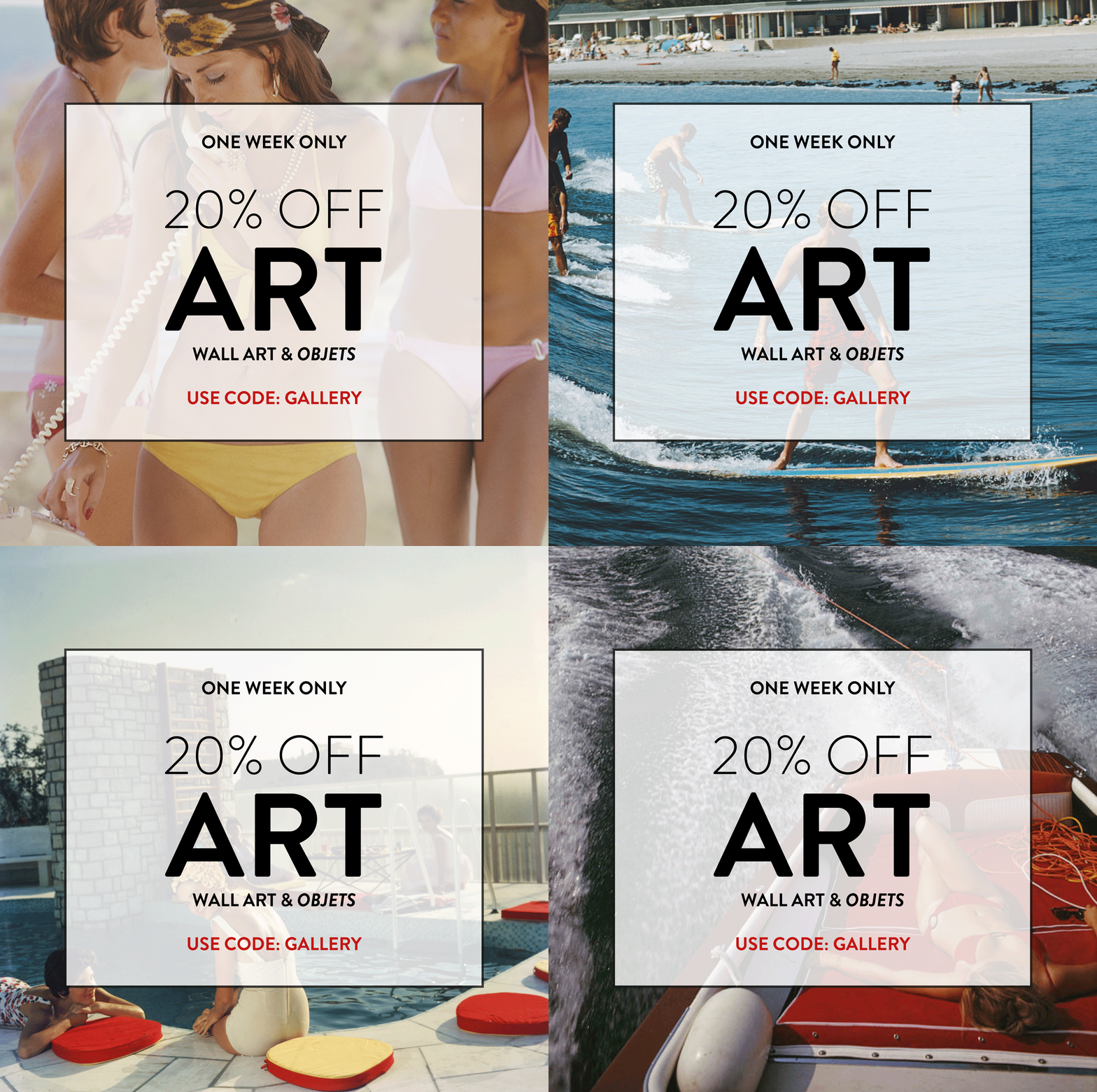
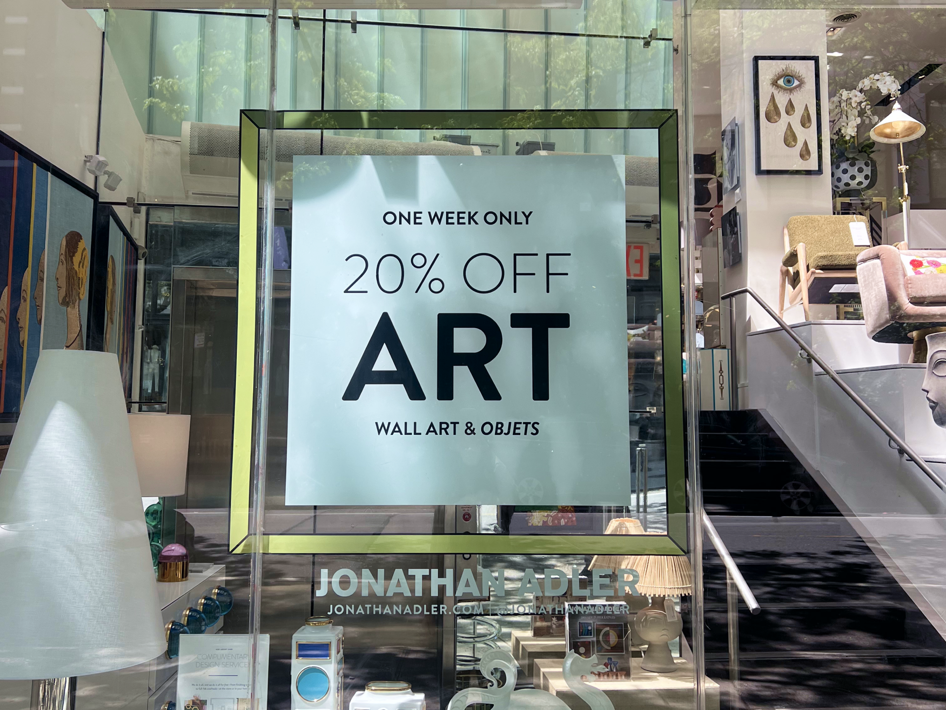
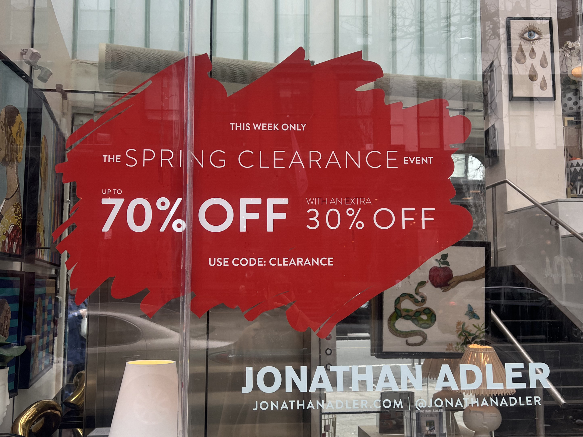
A central part of my role was establishing a repeatable campaign framework for promotional marketing. Each campaign's creative ships across email, SMS, web, social media, and retail print for all JA stores—requiring a system flexible enough to adapt across channels without losing cohesion.
My approach defined mini brand identities for each campaign—drawing from product catalog imagery to build cohesive visual systems. Typographic consistency became the structural anchor, creating space for bold color, movement, and decorative flourishes within the brand's maximalist language.


Selection of seasonal promotional campaigns spanning 2022–2025
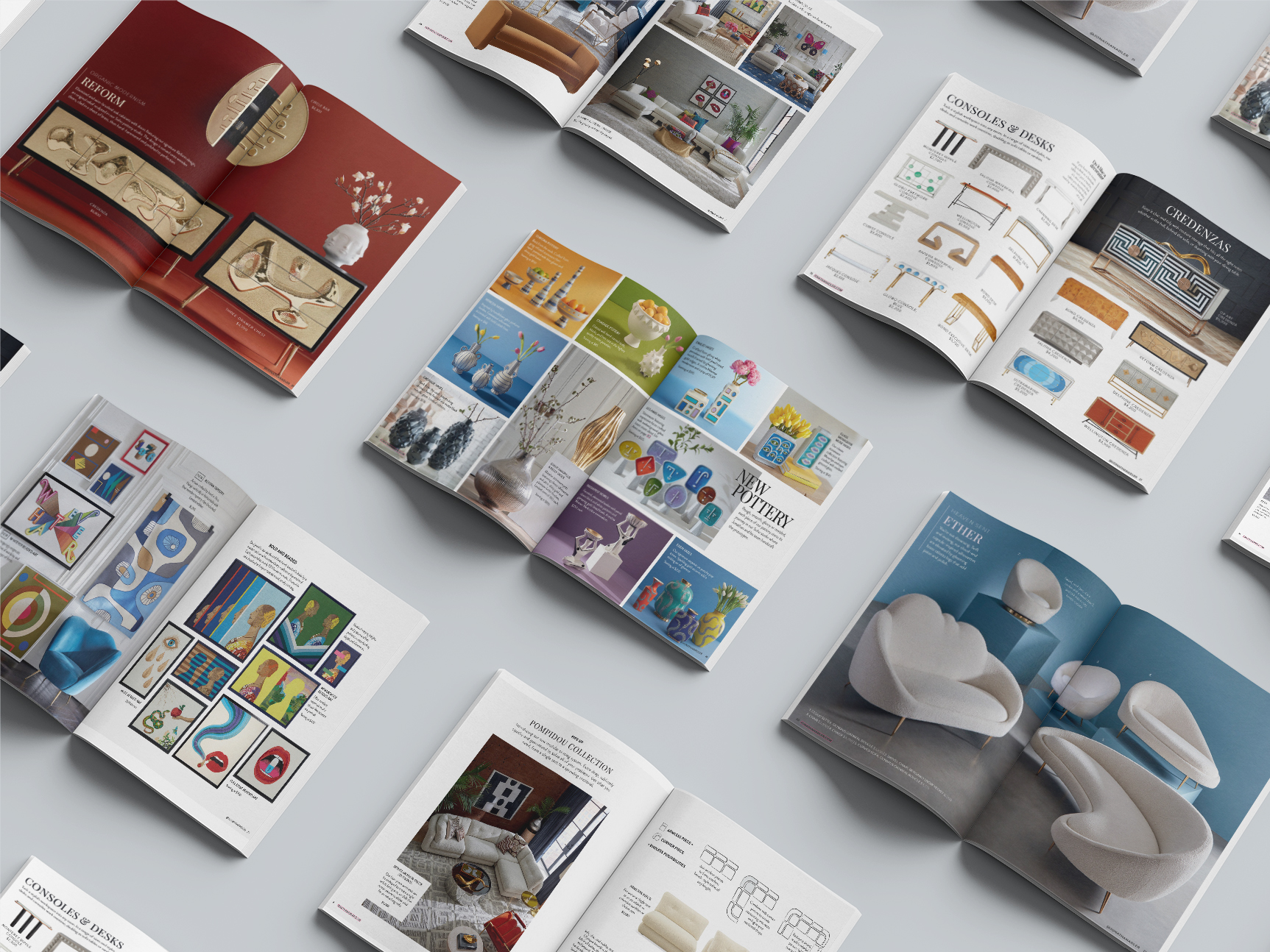
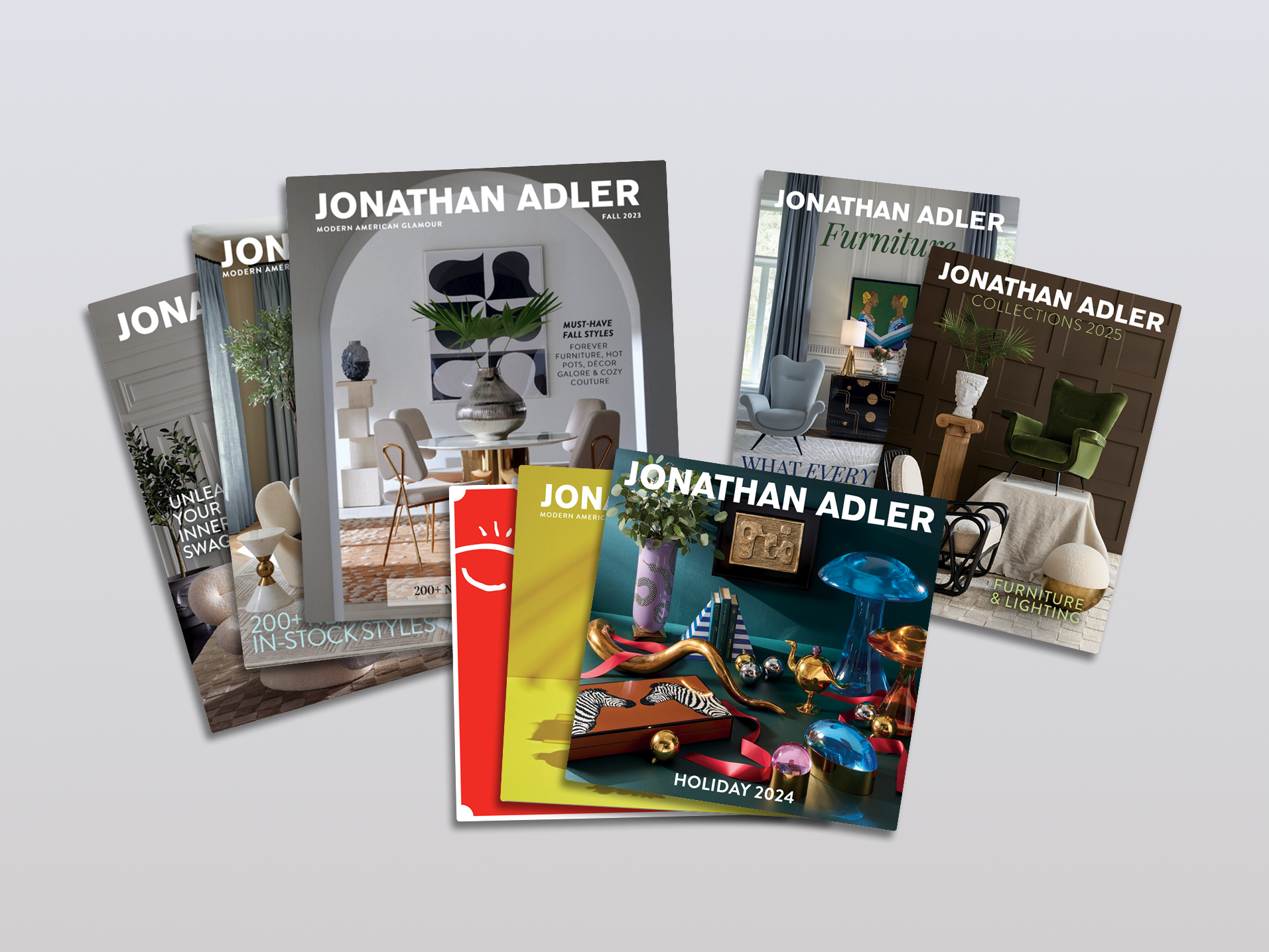
Every season, I collaborated with Jonathan himself, leadership, and the Brand Creative Director to produce a fully custom product catalog featuring new, bestselling, and signature pieces. These 70+ page catalogs reach over 500,000 customers quarterly, plus an additional holiday drop—each edition building on the editorial structure and production learnings of the last.


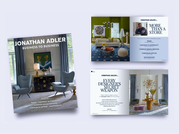
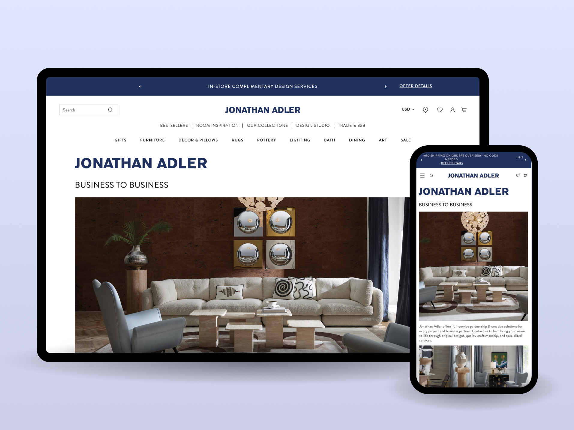
To increase awareness of the B2B program, I collaborated with senior leadership to consolidate and clarify program offerings into a cohesive print catalog and landing page. The challenge was translating a consumer-facing luxury brand into B2B-appropriate messaging without diluting the visual identity—resulting in increased partnerships and new client acquisition.


Beyond digital channels, I designed in-store signage and retail graphics for all Jonathan Adler retail locations—standardizing a signage system from window displays to interior wayfinding that maintained brand consistency across multiple store formats.


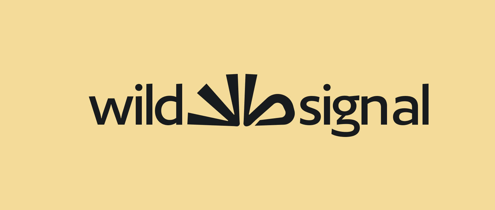
Full brand identity system for an AI-native communications agency — logo, iconography, color, typography, and usage guidelines built to scale from launch.
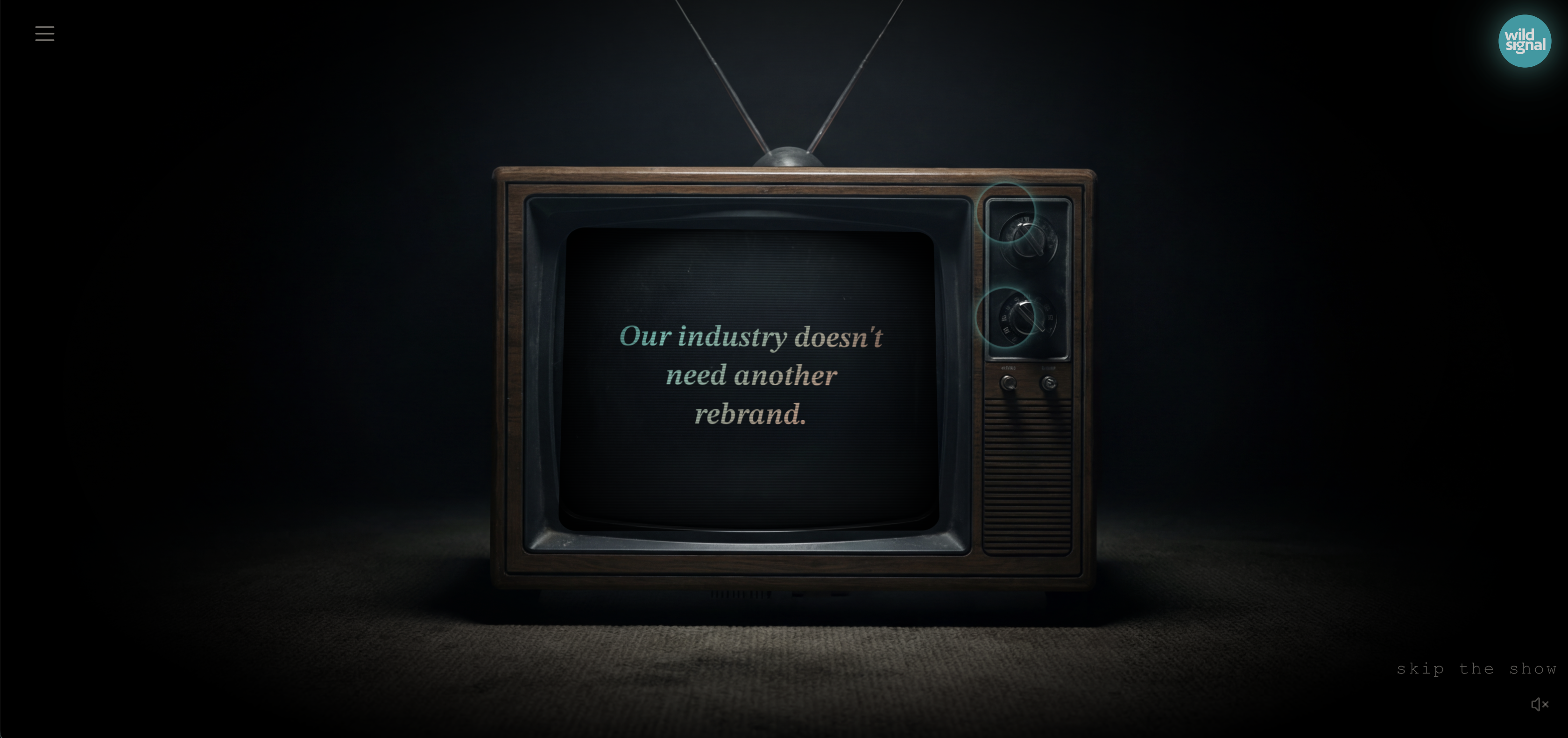
Wild Signal is an AI-native communications agency founded by experienced industry leaders, operating at the intersection of data-driven insight and creative execution. The company needed a complete visual identity that could establish credibility with enterprise clients from day one.
I developed the full identity system: logo, iconography, typography, color palette, and comprehensive brand guidelines. Working directly with both founders, I structured the visual language to be flexible enough for pitch decks today and scalable enough for a growing team and client roster over time.
Beyond the core identity, I produced launch-ready marketing assets—LinkedIn presence, pitch materials, and client-facing collateral for early engagements already on their roster.
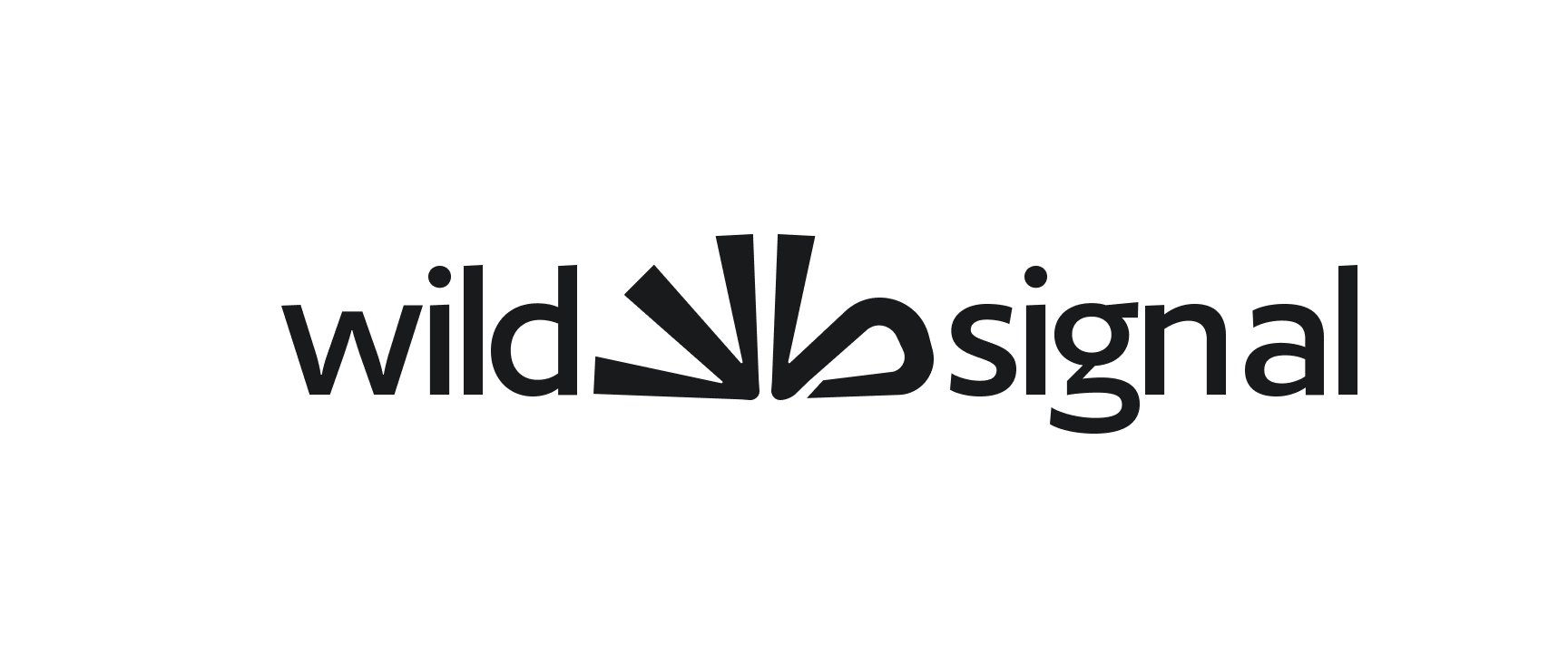
The constraint was clear: the mark needed to reference the initials WS without feeling literal or stiff. The brief called for trust and innovation with a subtle sense of playfulness—a visual shorthand for the agency's ability to simplify complex data and bring clarity to chaos.
These first-round concepts explore different structural interpretations of that idea, testing shape, personality, and flexibility to arrive at a mark that could function as a compact icon, an extended pattern, or a standalone symbol.
Pulse/radio wave, Scribble, direct messages, both S and W present in mark
"W" and "S" present in mark, pen-like strokes, can be used as an abstract font / extended background pattern
Arrow directing to specific point, abstract "W," snowflake imagery represents uniqueness of insights
Growing radio/signal wave, paint marks, scribbled "W" and "S," can be made into hand-drawn pattern
Growing radio/signal wave, paint marks, abstract "W"
Organic shape, growth, abstract "w"
Arch signal element, connecting journeys, "S", puzzle pieces coming together to make a clear image


The Wayfinder is a secondary brand element that distills the Wild Signal identity into a compact, versatile mark. Designed to adapt over time, it serves as a navigational icon, badge, and standalone symbol across brand touchpoints—giving the system a flexible secondary element independent of the primary logo.

The completed brand kit includes comprehensive guidelines for logo usage, typography hierarchy, color applications, and iconography. The system was structured so that non-designers on the team could apply it correctly without art direction—prioritizing consistency and self-service over bespoke production.
Illustration system, product UI, and brand identity for an early-stage platform where handcrafted visual design meets AI-driven storytelling.

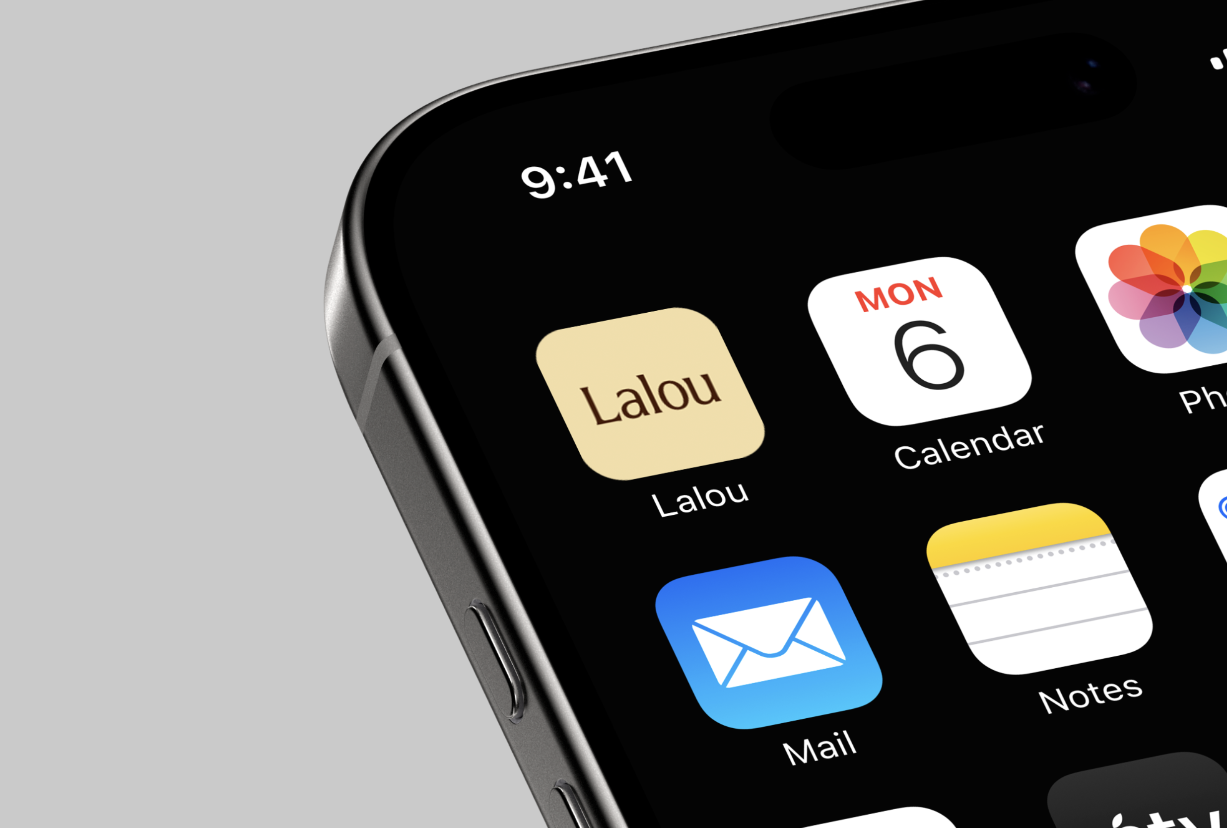
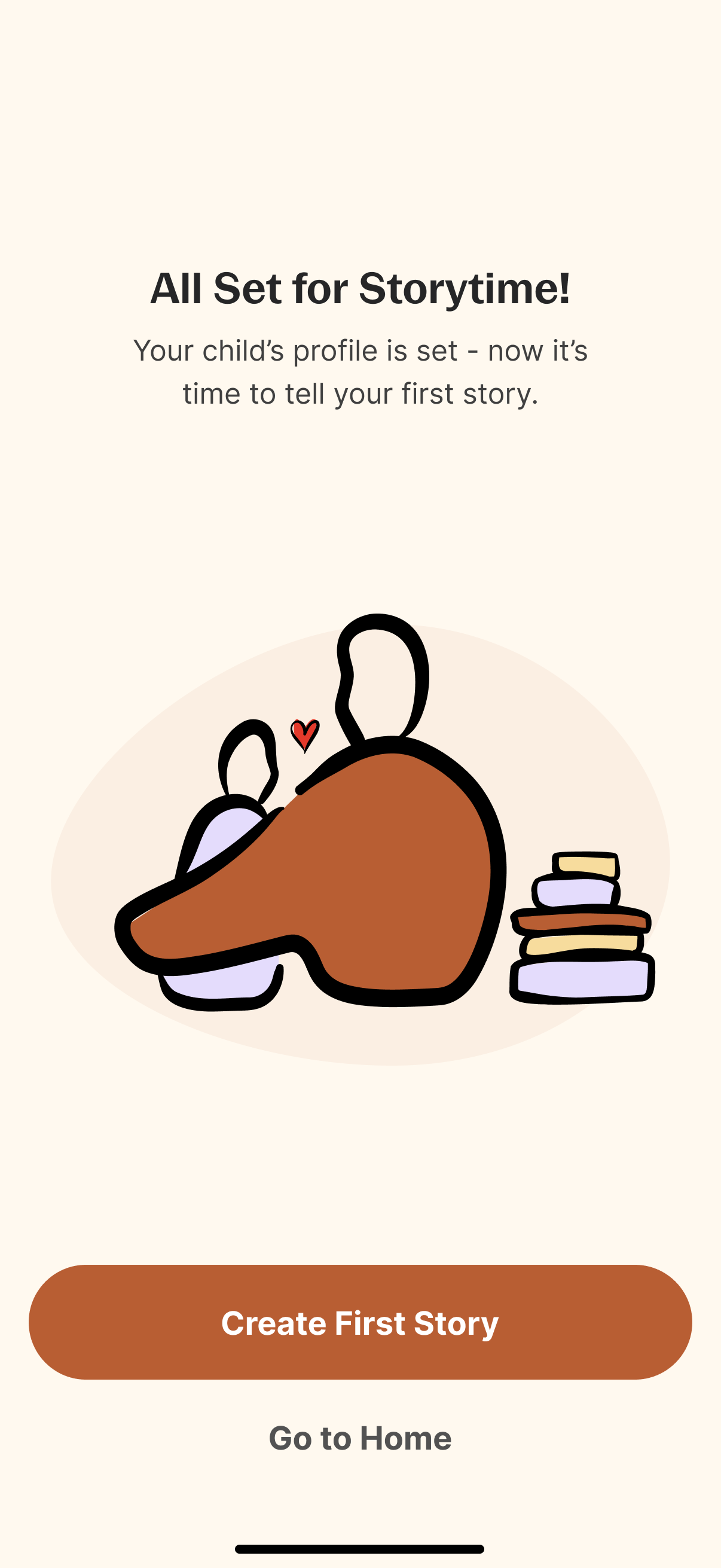
Lalou is an early-stage storytelling platform that lets families create personalized bedtime stories for their children. I partnered with the agency behind the product to establish the visual and creative foundation from scratch.
My role spanned brand identity, a flexible illustration system, and core product and marketing assets. The central constraint was building a visual world warm and expressive enough for children, yet structured enough to scale across a digital product with multiple surfaces and generated content.
A key design decision involved integrating AI-generated elements—Lalou uses ElevenLabs for personalized voiceovers and generates custom illustrated scenes per story. I defined the visual rules and style parameters so that AI-generated output would feel consistent with the handcrafted illustration system, rather than disconnected from it.
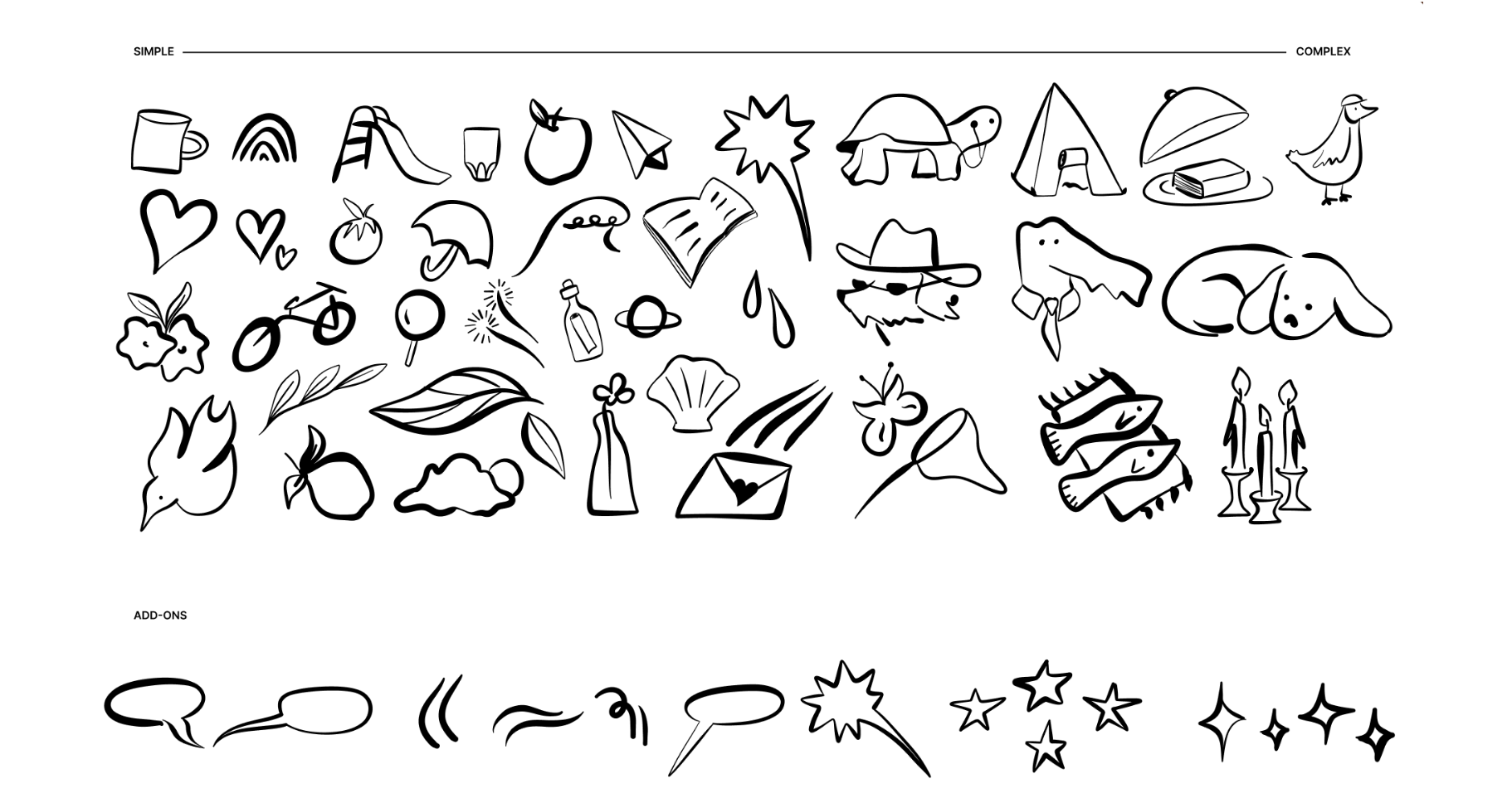
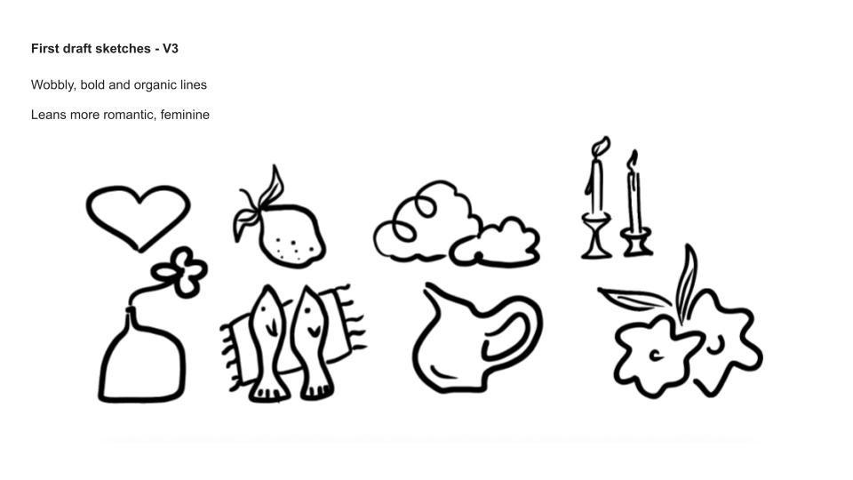
I explored a wide range of illustration directions to find a balance between expressive, childlike spontaneity and the clean, modular sensibility a digital product requires. Early sketches tested variations in line weight, proportions, and styling to define a repeatable structure flexible enough for story prompts, character moments, and UI surfaces.

.jpg)
.jpg)
.jpg)
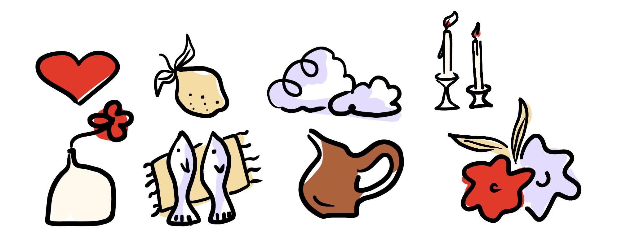
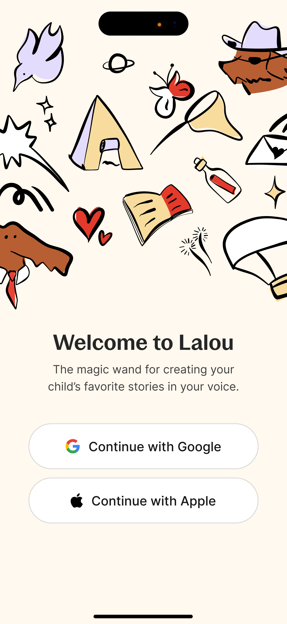
With the visual direction approved, I translated the chosen style into a complete illustration set—each asset refined for consistency, clarity, and usability across the product ecosystem. The final suite balances personality with functional simplicity, supporting both in-app moments and broader brand storytelling.
In the final product, the app generates custom illustrated scenes per story, referencing the style rules I established and pulling themes from the narrative itself. The system was designed so generated illustrations feel like natural extensions of the hand-drawn originals.


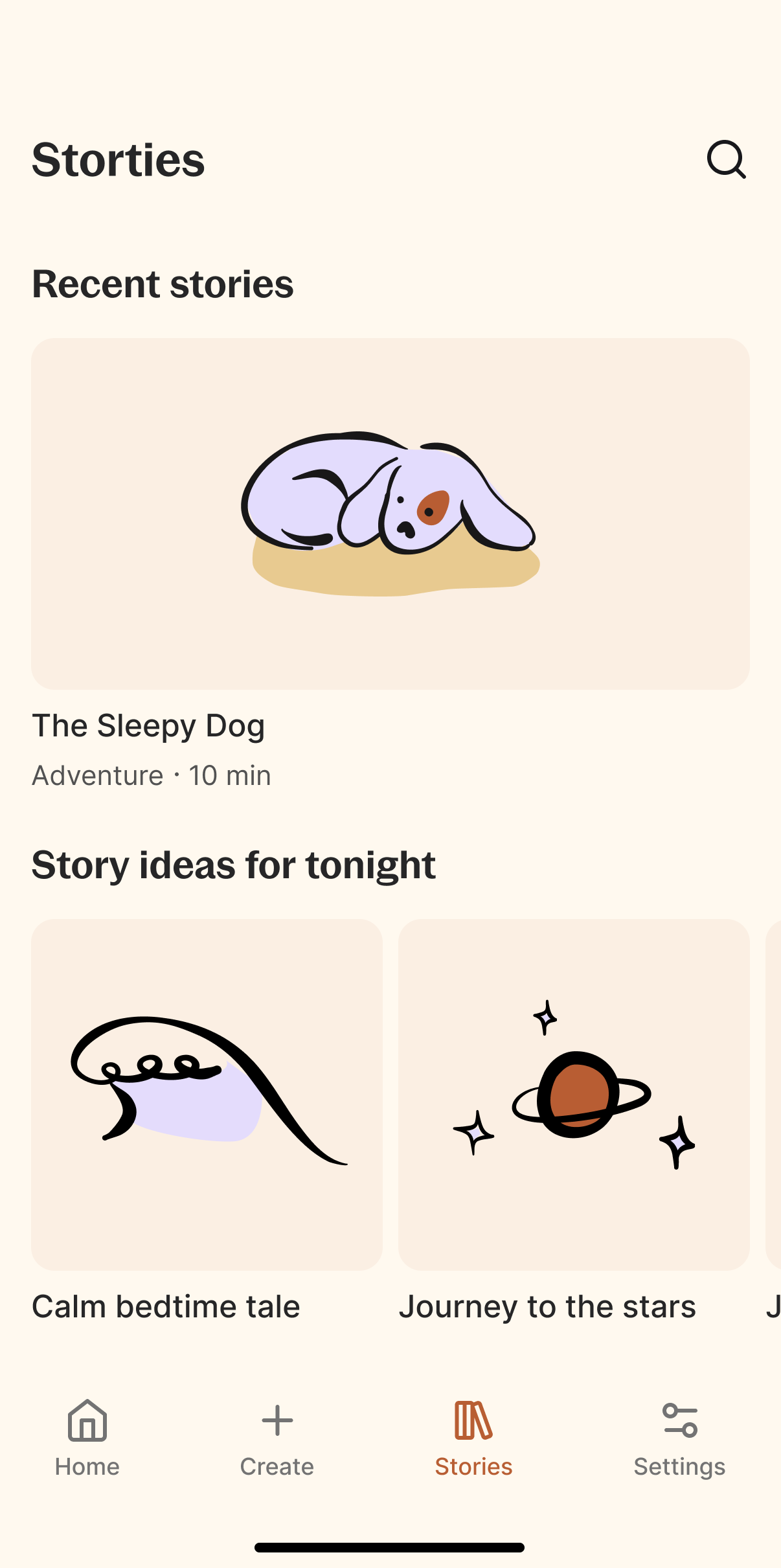
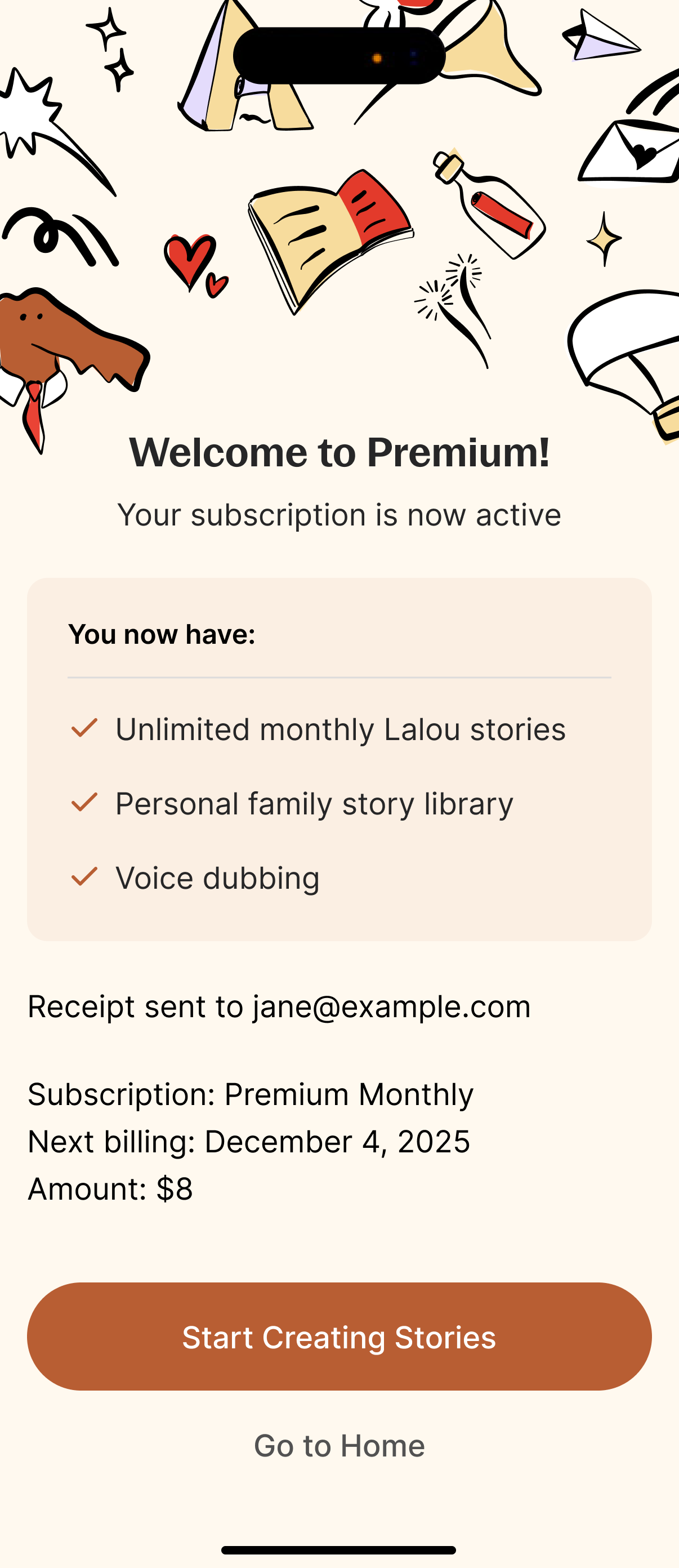
Once the illustration language was established, I brought it into early product mockups to test how the system would operate within the app. The screens pair simple, intuitive UI with playful visual moments—optimizing for clarity for parents and engagement for children.
The AI voice generation layer adds personalization without interface complexity. The design decision was to keep the technology invisible—users experience the result, not the mechanism.
The landing page extends the brand identity into a marketing environment structured around conversion and trust. It introduces the platform's purpose, surfaces the AI-driven storytelling approach, and guides users through core features. Layout, typography, and illustration work together to make a product that involves AI feel approachable rather than technical.

End-to-end product campaign — photography, web design, and animation from a formal client brief at the Wix Playground Academy.

The Wix Playground Academy is a selective program covering studio photography, coding, animation, UX, art direction, and marketing. The program operates on real client briefs with professional production standards.
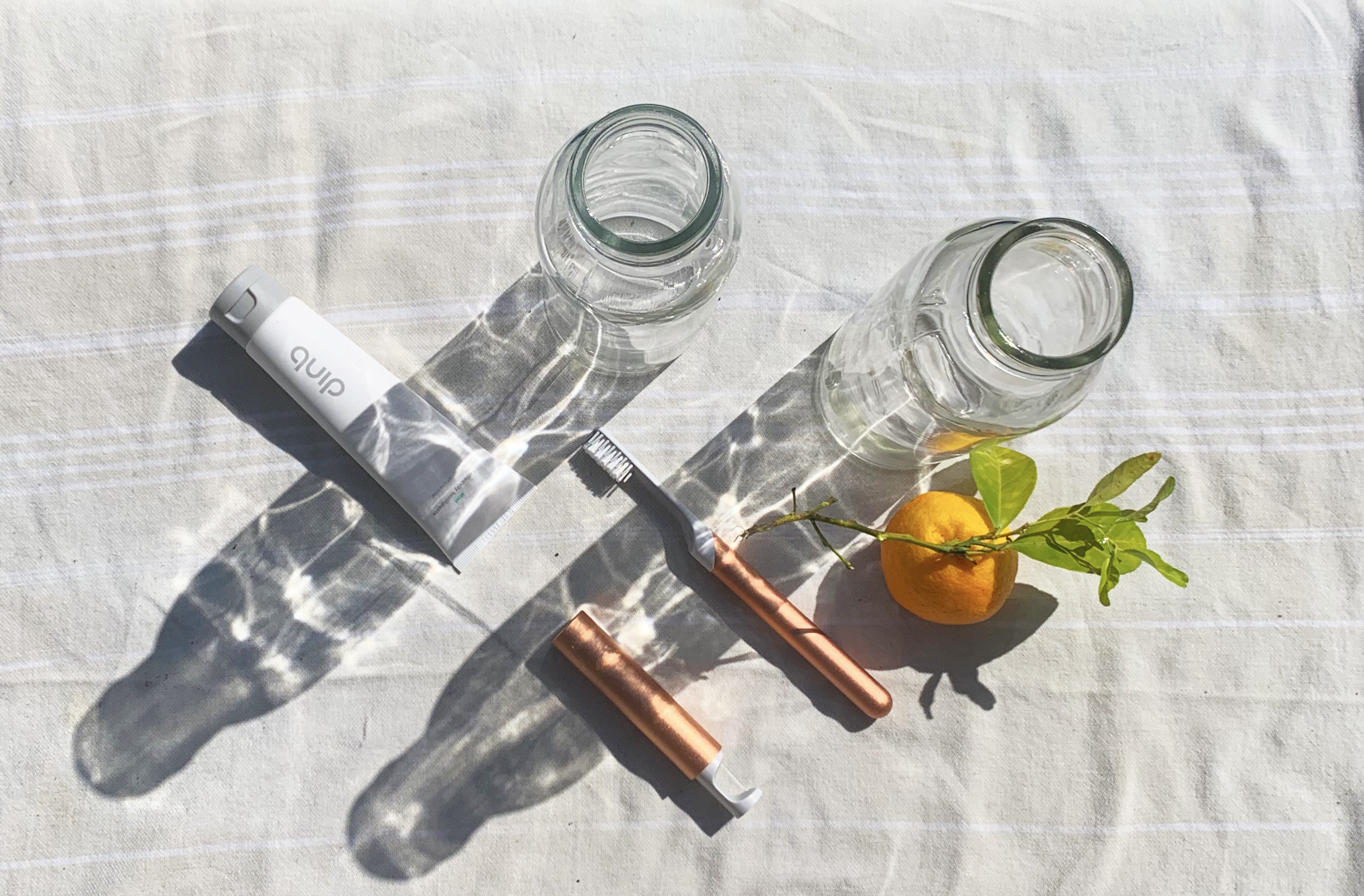
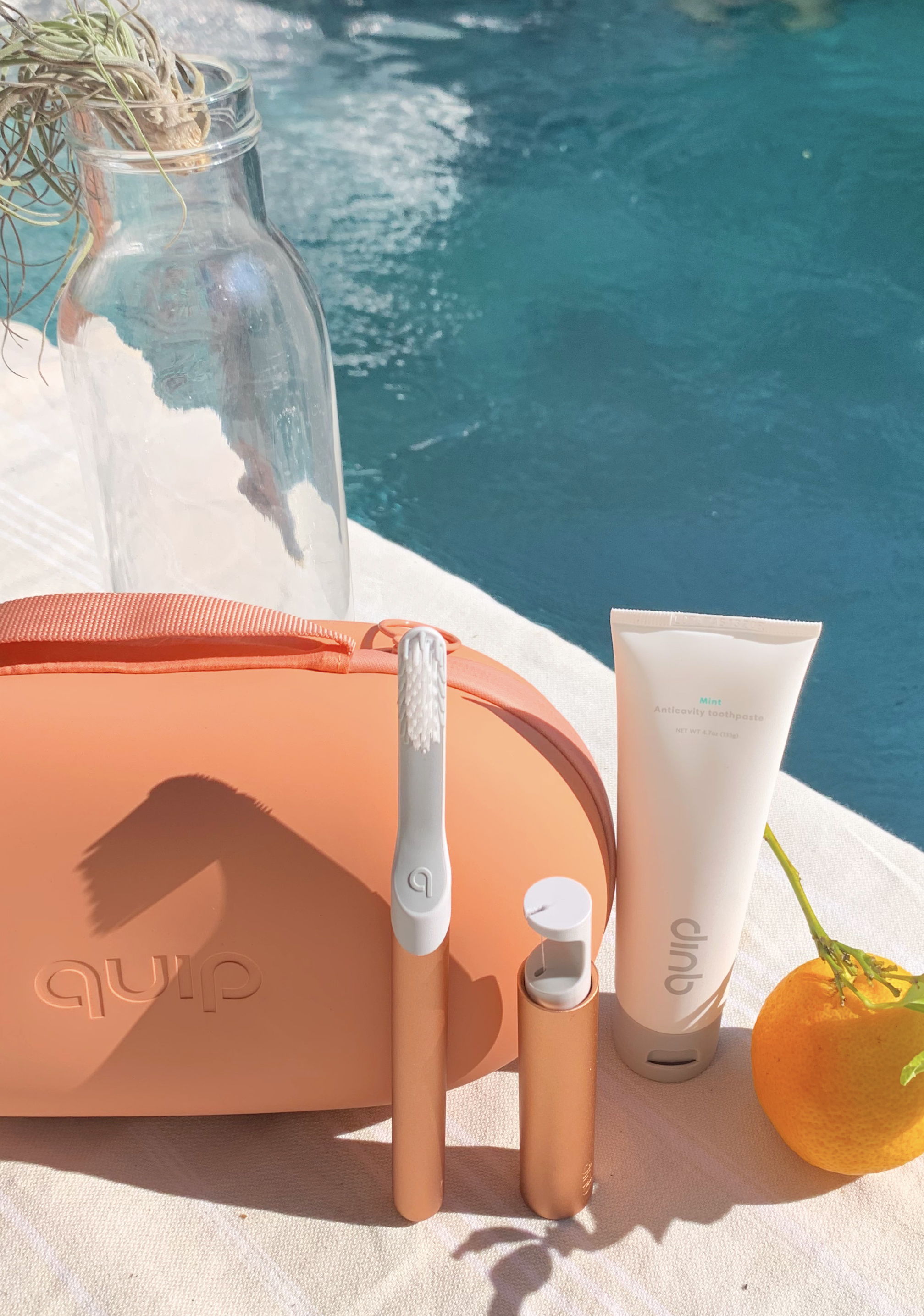
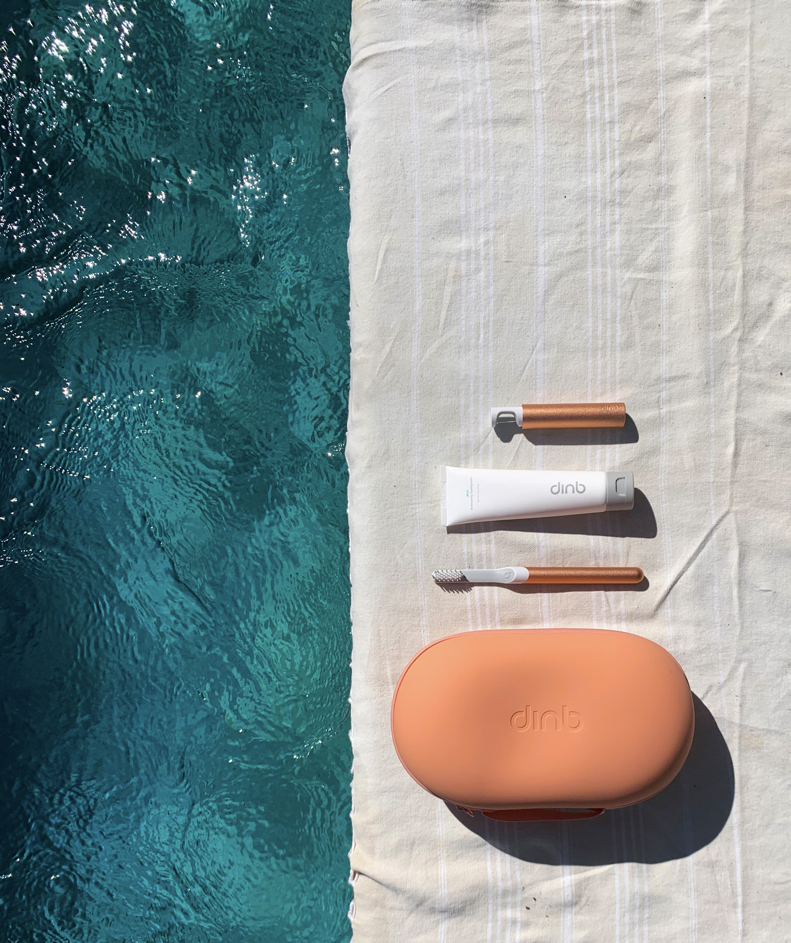
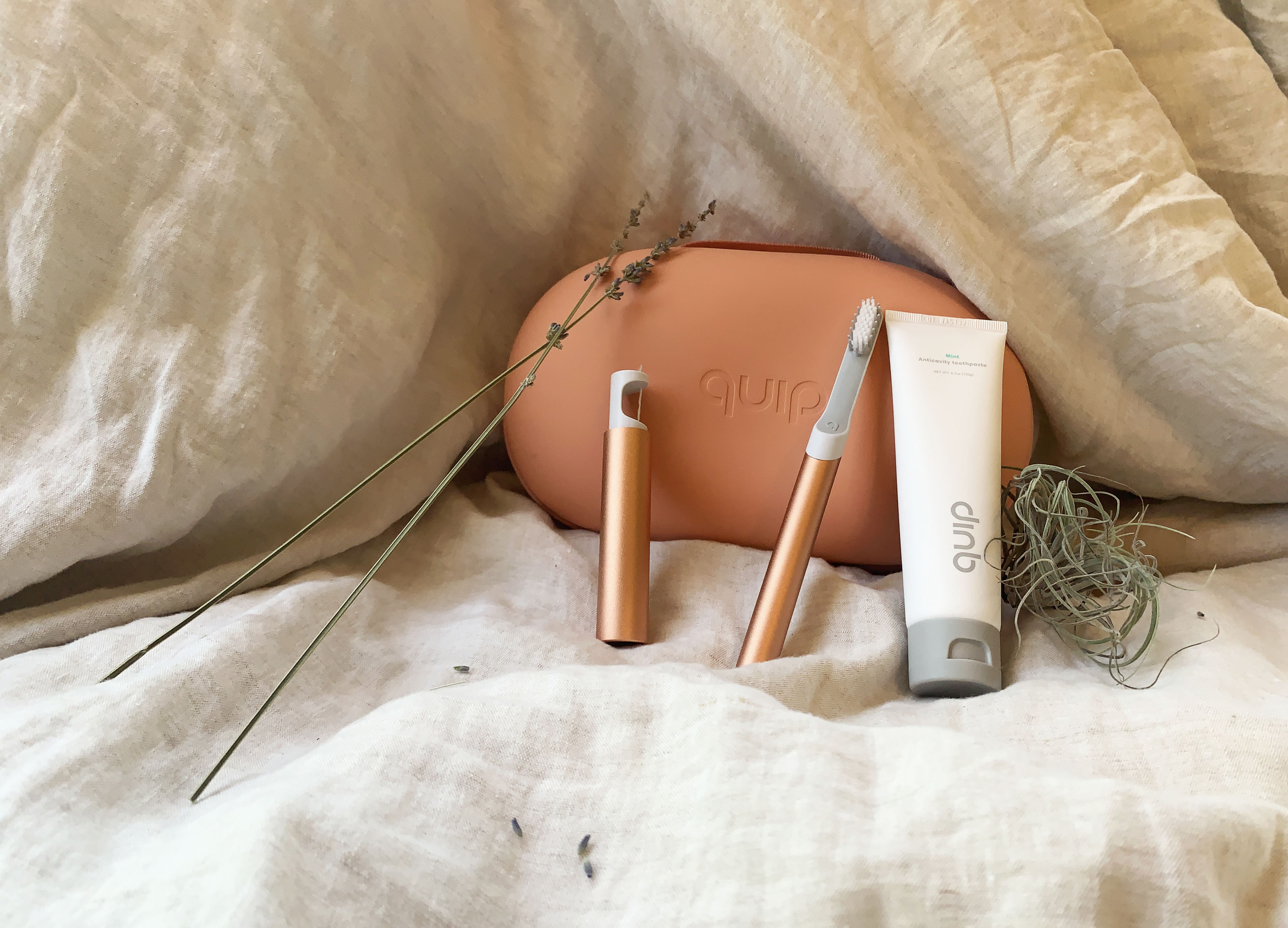
This project responded to a formal brief from Quip, a DTC dental company. The challenge was repositioning an everyday product as a desirable gift—shifting the framing from utility to experience. All photography, animation, and web design is original work.
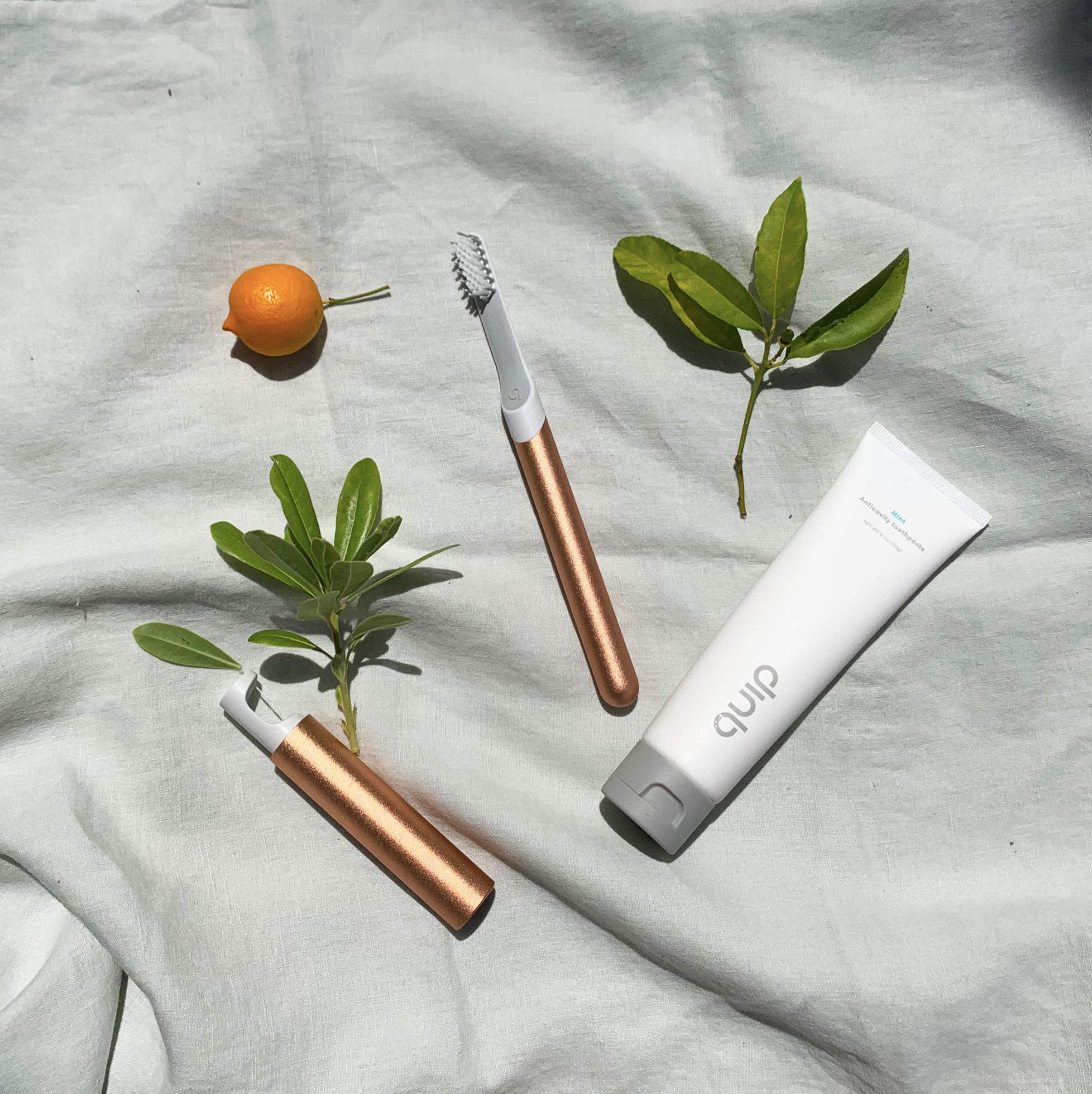
I styled and photographed the Quip product line with a focus on clean, elevated compositions that reinforce the gifting narrative. The approach established a repeatable structure across shot types—detailed close-ups, full-set arrangements, and lifestyle contexts—to support different marketing surfaces.

Featured on quip's official instagram page

The landing page concept positions Quip as an ideal gift, structuring the narrative around packaging elegance and subscription value. Clean typography and generous whitespace let the photography carry the persuasion—a deliberate choice to prioritize image quality over layout complexity.
Website design and information architecture for a digital-first career coaching platform — translating app product into a marketing-ready web presence.
Chea Seed is a digital-first career coaching platform—a career fitness tracker that helps users navigate raises, reviews, job transitions, and professional confidence. The product existed as an app; the website needed to translate that experience into a compelling marketing surface.
Working directly with the CEO and lead developer, I mapped the app's structure, brand personality, and user value into a scalable framework for the site—product information, company backstory, blog, and career resources. The challenge was structuring content for two distinct audiences: new visitors discovering the product and returning users seeking resources.
The wireframing process established information hierarchy and user flow before committing to visual design. Each page structure was defined around a clear decision: what does this audience need first, and what can wait? This prioritized scannability and conversion paths over visual density.
"Being Los Angeles" — a conceptual exhibit campaign reframing a museum brief into a city-scale public installation and wayfinding system.
As part of a four-person executive team selected from the senior class, I led the creative direction for a semester-long partnership with the Los Angeles Natural History Museum.
The museum brief, "Becoming Los Angeles," asked for a temporary exhibit representing LA's diversity. Pandemic constraints made physical production impossible, which became a creative advantage—it freed us to propose something more ambitious than a traditional gallery exhibit.
Our reinterpretation turned the city itself into the gallery space: native architecture and everyday objects as the items on display, with a distributed installation system designed to weave the exhibit narrative into LA neighborhoods. The concept reframed the brief from "exhibit about LA" to "exhibit that is LA."
The visual identity draws from LA's architectural vernacular and cultural diversity. The design system needed to work across physical installations, printed collateral, and digital surfaces—balancing the city's visual energy with museum-quality sophistication.
The centerpiece is a modular architectural shelter designed for placement across LA neighborhoods. Each structure serves dual functions—wayfinding and exhibit content—introducing passersby to the "Being LA" narrative. The modular design logic allowed the system to adapt to different neighborhood contexts while maintaining a consistent identity.
Personal brand and e-commerce store — end-to-end ownership of brand, product, photography, and web, with 10% of profits donated to the California Farmworker Foundation.
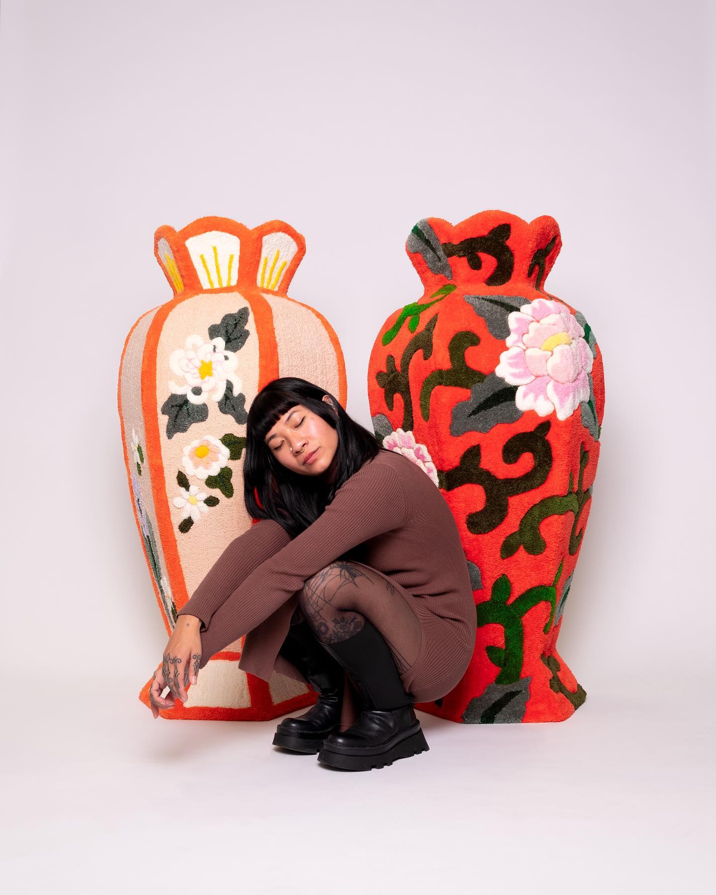
Picked Fruit is a DTC brand I founded and operate end-to-end—product development, brand identity, photography, web design, and fulfillment for handmade crocheted and tufted garments, bags, artwork, and rugs. Running every layer of a small business has sharpened how I think about design as a system that connects product, brand, and operations.
The brand is founded on honoring the wellbeing of California's farmworkers, with 10% of all profits donated to the California Farmworker Foundation (CFF). The mission isn't marketing—it's the structural reason the brand exists.
All photography is shot and styled in-house. I established a consistent visual framework—emphasizing texture, color, and craftsmanship—that maintains a warm, approachable aesthetic across product listings, social content, and marketing materials.
The website balances e-commerce functionality with mission storytelling and process transparency. The structure prioritizes product discovery while giving the charitable model and handmade process meaningful presence—without letting either overshadow the other.


I'm Talia, a brand and visual designer based in Brooklyn. I build design systems, campaign frameworks, and visual identities that hold up at scale — shaped by six years in-house at Uncommon Goods and Jonathan Adler, plus 50+ freelance brand builds for startups and small businesses since my time at USC.
My work sits at the intersection of brand craft and operational thinking — translating strategy into production-ready systems across digital, print, and retail, and collaborating cross-functionally with engineering, marketing, and product teams. I'm increasingly drawn to how AI tools reshape creative workflows, and I use them daily in my own practice.
View resume